Nonprofit Direct Mail Examples
Higher Returns and More Buzz…
Are you looking for new ways to insure that your direct mail campaigns get higher returns and more buzz? Engage our services to create a campaign that compels your constituency to take notice and donate. Below are many examples of nonprofit direct mail campaigns we’ve created.
- We brainstorm your options and create concepts to fit your needs.
- We develop budgets based on quantities, lists and known response rates.
- We develop warm and fuzzy graphics that prospective donors respond to – they can’t resist.
- We organize your lists and donor attributes into categories that make sense and which are geared to increase response.
- We work as an agency to find the best printer and lettershop to handle your job.
- We create efficient campaigns that save valuable assets.
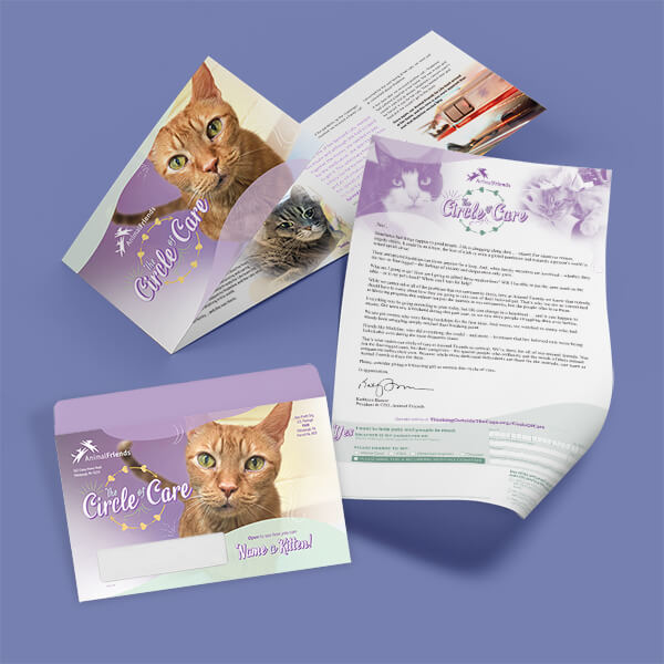
The Circle Of Care: A Nonprofit Animal Shelter Direct Mail Fundraiser Campaign
Letter & Brochure Package
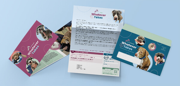
The example shown was designed with 4 pieces – a full-color outer envelope, a personalized letter with donor gift strings, a brochure and a return envelope.
This visually compelling direct mail package aims to inspire generosity for Animal Friends, a premiere animal shelter in Pittsburgh, PA. It features a cohesive design across all four elements:
Design Focus:
Intriguing imagery and color scheme that immediately grabs attention and communicates the cause.
Key Elements:
A compelling headline and tagline that piques curiosity and encourages opening.
Donor name prominently used for personalization with individualized donor gift strings.
A heartfelt message that connects emotionally with the recipient.
Warm, handwritten-style font for a personal touch.
Professional, high-quality retouching of photography and clean illustrations
A clean, modern layout with clear calls to action.
A consistent color palette throughout the package creates a unified and memorable brand experience.
The “Circle of Care” theme emphasizes the interconnectedness of the community and the power of collective action.
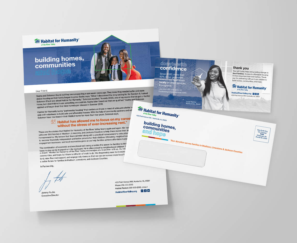
Direct Mail Helping a Nonprofit Build Homes. Build Communities. Build Hope.
Letter Package
A direct mail fundraiser with a heartfelt story about a family whose life was transformed by Habitat for Humanity. This campaign was created for existing donors and for prospective donors who were selected from a highly-targeted list of like-type donors. A reply device with varaible gift string donation amounts was included.
Our Habitat for Humanity direct mail campaign captures attention & stands out.
In a cluttered mailbox: A visually striking envelope with impactful imagery and bold colors immediately grabs attention.
First Impressions Matter: The design is the first point of contact. It’s inviting and professional, encouraging recipients to open the package.
Visual Storytelling: Photos and illustrations powerfully convey the impact of Habitat for Humanity’s work. They showcase the joy of homeownership, the strength of community, and the hope that a decent home provides.
Clear & Concise Messaging: Design elements point the reader’s eye and emphasize key messages:
- The urgent need for affordable housing
- The transformative power of homeownership
- How donors can make a difference
Builds Trust, Credibility and Professionalism:
The polished, well-designed package reflects positively on Habitat for Humanity as an organization. It conveys trustworthiness and inspires confidence in their mission.
Clear Calls to Action: Design elements like prominent donation buttons, easy-to-read reply envelopes, and clear instructions make it simple for recipients to take the next step.
Emotional Resonance: Our design evokes emotions of empathy, compassion, and hope, inspiring donors to connect with the cause on a deeper level.
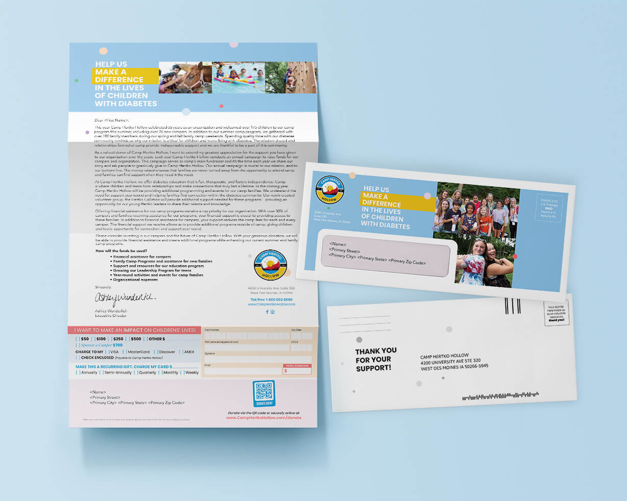
Helping Kids with Diabetes Thrive – A Mailer Requesting Support for Kids Who Can’t Afford Camp
Letter Package
Each summer, Camp Hertko Hollow provides children with type 1 diabetes a safe, therapeutic, and empowering camp experience where they can be active, build confidence, and meet others who truly understand their challenges.
At camp, children learn critical diabetes management skills—monitoring blood glucose, managing insulin, and learning the balance of carb counting— while enjoying the freedom to just be kids. Camp Hertko gives campers a sense of normalcy and belonging, having a positive impact on their self-esteem, mental health, and approach to managing diabetes.
Our well-designed direct mail package plays a pivotal role in capturing attention, connecting emotionally with recipients, and driving higher donations.
Here’s how we use design to increase returns:
Emotionally Resonant Imagery Showcasing Happy Campers: Use of images with children enjoying camp activities, smiling, and connecting with peers. This helps potential donors visualize the impact of their contributions.
Before and After Stories: We include compelling visuals that show how children’s lives are positively transformed by attending the camp.
Personal Connection: Use of close-ups to make the imagery personal and relatable, allowing donors to connect with individual stories.
Engaging and Clear Design: Use of attention-grabbing headlines that highlight the impact of the camp.
Bright, Inviting Colors: Incorporation of cheerful, yet professional colors like sky blue, soft salmon, and warm yellow to evoke feelings of hope and vitality.
Easy-to-Follow Layout: Digestible sections with bullet points, subheadings, and clear calls to action.
Personalization & Custom Messages: Inclusion of the recipient’s name in the salutation and any headers.
Clear Call to Action: The donation form, QR code, or link to the online donation page is easy to find and stands out visually.
Multiple Giving Options: Highlighted ways to donate—online, by mail, or via QR code.
Bring Hope and Healing to Haiti Through Donor Support
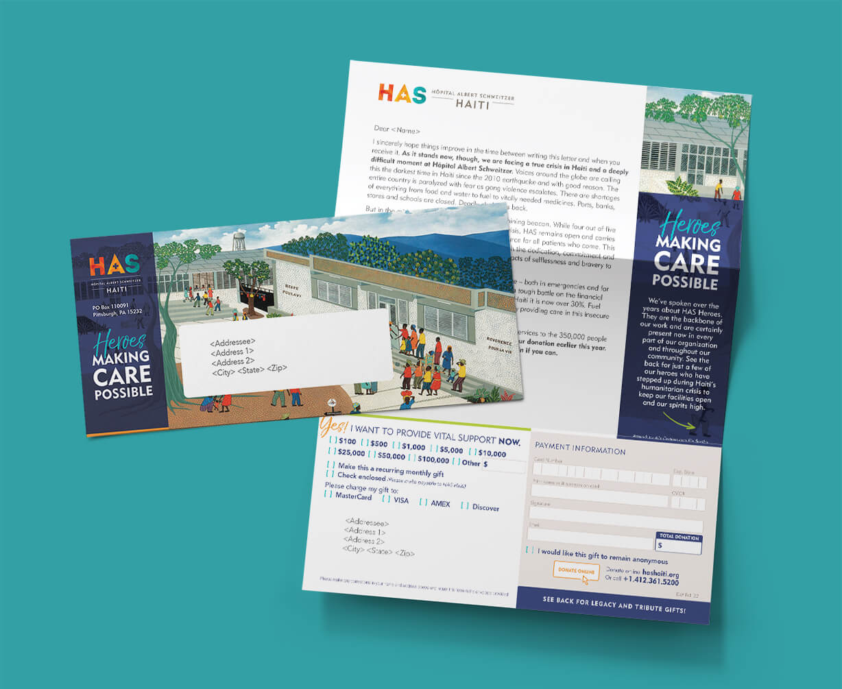
Haiti’s hospitals are overwhelmed, and countless lives depend on urgent medical care. This campaign solicited donations to provide life-saving medicines, essential medical equipment, and support for patients in desperate need.
Results-Oriented Approach:
This campaign combined emotional storytelling, visually engaging materials, and ease of response to maximize its effectiveness. Every detail—from the vibrant outer envelope to the clear reply device—was designed with the donor experience in mind, ensuring they felt empowered and inspired to take action.
Components:
Letter with Reply Device:
The heart of the campaign was a heartfelt, two-sided letter addressed to the recipient. The letter opened with an emotionally resonant story of resilience—highlighting the challenges faced by patients and staff at the hospital in Haiti. It introduced the theme of “heroes,” positioning the donor as an essential part of the solution.
The letter emphasized the tangible impact of their donations. A simple and clear reply device was included at the bottom, with pre-filled donation amounts and a checkbox for recurring contributions.
Full-Color Outer Envelope:
The outer envelope was designed to stand out in the mailbox and entice recipients to open it.
The design featured a bold headline: “Heroes Making Care Possible” paired with a reproduction of a painting of the hospital.
Design Features:
The visual design played a crucial role in reinforcing the campaign’s message:
Colors and Imagery:
Warm, hopeful colors paired with imagery created an emotional connection while emphasizing the impact of donor contributions.
Typography: A combination of bold, attention-grabbing headlines and clean, readable body text ensured the campaign felt professional yet approachable.
Branding: Consistent use of the hospital’s logo and thematic graphics tied the materials together, building trust and recognition.
Helping Foster Kids Feel Confident – NonProfit Direct Mail
Campaign Overview:
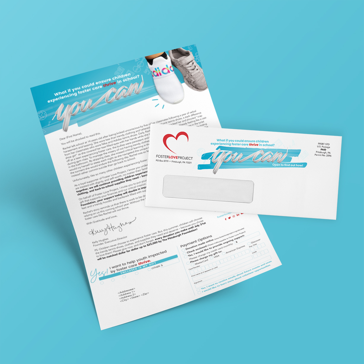
The annual fundraiser campaign was thoughtfully designed to address the challenges faced by foster kids who lack access to everyday essentials, such as well-fitting clothes and shoes. The campaign aimed to evoke empathy and inspire donors to provide foster children with the opportunity to shop for clothing that suits their style and needs—an experience that fosters self-esteem and a sense of belonging.
Components:
Full-Color Letter with Reply Device:
The centerpiece of the campaign was a full-color, emotionally compelling letter.
Visual Appeal: The letter was designed with warm, inviting colors.
Call to Action: Key phrases such as, “Every child deserves to feel they belong,” and, “Your gift provides more than clothes—it provides confidence and dignity,” encouraged immediate action.
Reply Device: At the bottom of the letter was a tear-off reply device, pre-printed with suggested donation amounts (e.g., $25, $50, $100, or “Other”) and the option to make a recurring monthly gift.
Full-Color Outer Envelope:
The outer envelope was designed to catch the recipient’s eye and spark curiosity while clearly conveying the campaign’s purpose.
Imagery and Colors: Bright, cheerful colors (e.g., yellows and light blues) were chosen to evoke hope and positivity.
Reply Envelope:
The reply envelope was designed to simplify the donation process.
Design Features:
The design was a crucial aspect of this campaign, enhancing its emotional impact and readability:
Colors and Typography: Bright, uplifting colors and friendly, easy-to-read fonts ensured the materials felt approachable and hopeful.
Branding: Consistent use of the organization’s logo, brand colors, and messaging created trust and familiarity across all materials.
Emotional Appeal and Donor Engagement:
This campaign was crafted to connect with donors on a personal and emotional level. By emphasizing the profound difference that proper clothing can make in a foster child’s life, the materials framed the donor as a key part of the solution—someone who can restore dignity and joy to a child in need.
Every element, from the eye-catching outer envelope to the clear reply device, was designed to create a seamless and emotionally impactful experience that inspires generosity and compassion.
Enriching Lives, One Letter at a Time: Our Direct Mail Campaign for Special-Needs Kids
Direct mail remains a powerful tool for nonprofits to raise funds and build awareness, thanks to its personal touch and tangible impact. Here’s how it works effectively:
1. Fundraising through Emotional Storytelling
Human-centered narratives: Sharing real stories — like a child overcoming challenges — creates an emotional connection with donors.
Imagery: The photos of the kids impacted by the cause make the appeal feel personal and relatable.
2. Personalization
Tailored messaging: Using the recipient’s name and referencing their past support boosts engagement.
Segmented lists: Different appeals can be crafted for new donors, recurring givers, and lapsed supporters to speak directly to their relationship with the nonprofit.
3. Clear Calls to Action (CTAs)
Donation-focused language: Phrases like “Your comapassion and generous gift of $100 pays for dozens of specialized lessons” spell out how donations will be used.
Multiple giving options: We include QR codes, website links, and pre-addressed reply envelopes to simplify the donation process.
4. Multi-piece Packages for Impact
Letters with tear-off coupons: Make donating easy by allowing recipients to simply fill out a form and return it.
Buckslips or inserts: Highlight specific initiatives, like “Sponsor a child today,” to break down giving options.
Reply envelopes: Reply envelopes encourage quick responses, removing a barrier to donating.
5. Building Awareness
Educational content: Direct mail can share facts, infographics, and testimonials that inform recipients about the nonprofit’s mission.
Event invites: Promote upcoming fundraisers, galas, or community events, reinforcing the organization’s presence and inviting participation.
By combining strong storytelling, thoughtful design, and clear calls to action, direct mail helps nonprofits create memorable campaigns that inspire giving and grow awareness.
Elegance: Successful Fundraising Events Start With Impactful Invitations
Riverlife Party at the Pier
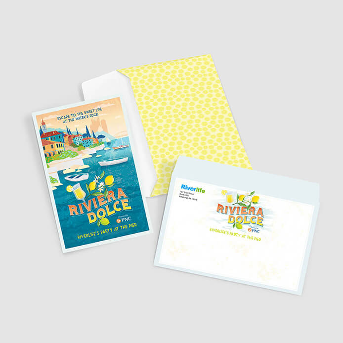
Planning an important event? Choose us to create an invitation that captures the attention of your donors and compels them to attend. The image shown includes the design of the card, full color outer envelope and the logo. We also manage all of the production and mailing.
Where Size Meets Sophistication: Our Large Envelope Letter Packages Make a Statement
Animal Friends’ High-Impact Mailer
Donor campaigns rely on well-told stories that demonstrate the value of the nonprofit organization. Readers become donors when a story creates an emotional attachment. In the example shown, Animal Friends tells how they rescued a starving and abused puppy, then brought her back to health and a happy new life in an adopting home.
Where Creativity Meets Compassion: A-7 Sized Donor Campaigns
A Fundraiser for Meals on Wheels
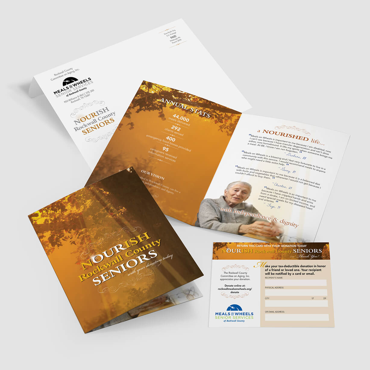
Meals on Wheels hired us to create a donor campaign soliciting new donors. The mail package shown includes an A-7 outer envelope, a greeting-card-styled insert with facts about the number of individuals who benefit from meals, a reply card and reply envelope.
Testing the Waters: Exploring the Success of Different Theme Ideas in Direct Mail
Create 2 Unique Mailers with Varying Text and Keep Track of Results
We created 2 unique mailers, one based on individual stories and one based on our client’s research studies. Each package was mailed to equal quantities of homogeneous lists at the same time. Results were measured to determine which theme worked best. Subsequent package design will engage the data to enhance returns the next time the package is mailed to a larger list.
Crafting Connections: The Power of Letter-Sized Solicitation Mailers
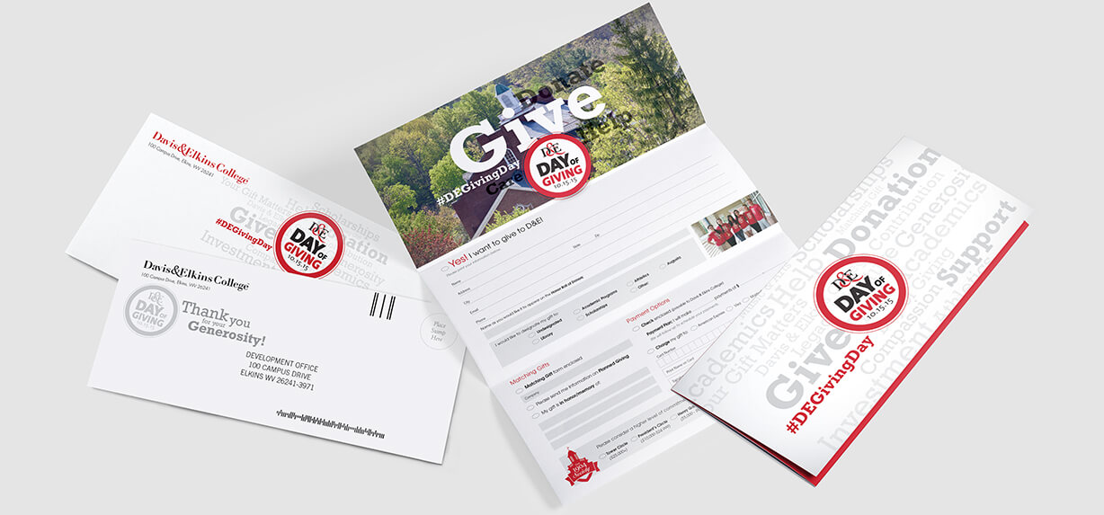
A “Day of Giving” Donor Mailing
Davis & Elkins College hired us to create this first-ever Day of Giving package. The package included a personalized #10 business envelope, personalized letter, full-color reply form and reply envelope. Our role included writing, design, printing and mailing services.
From Our Hearts to Yours: Greeting Card Donor Campaigns that Inspire
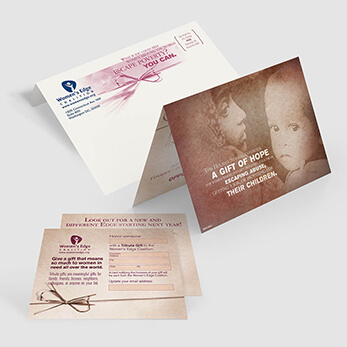
Women Thrive Worldwide
A nonprofit agency located in Washington, DC, hired us to design the mailer shown. Graphics depict an old-world look and support the copy visually. Funds acquired form donors are used to aid women in poverty by helping them become responsible for themselves.
Where Style Meets Celebration: An Event Invitation Example That Leaves an Impression
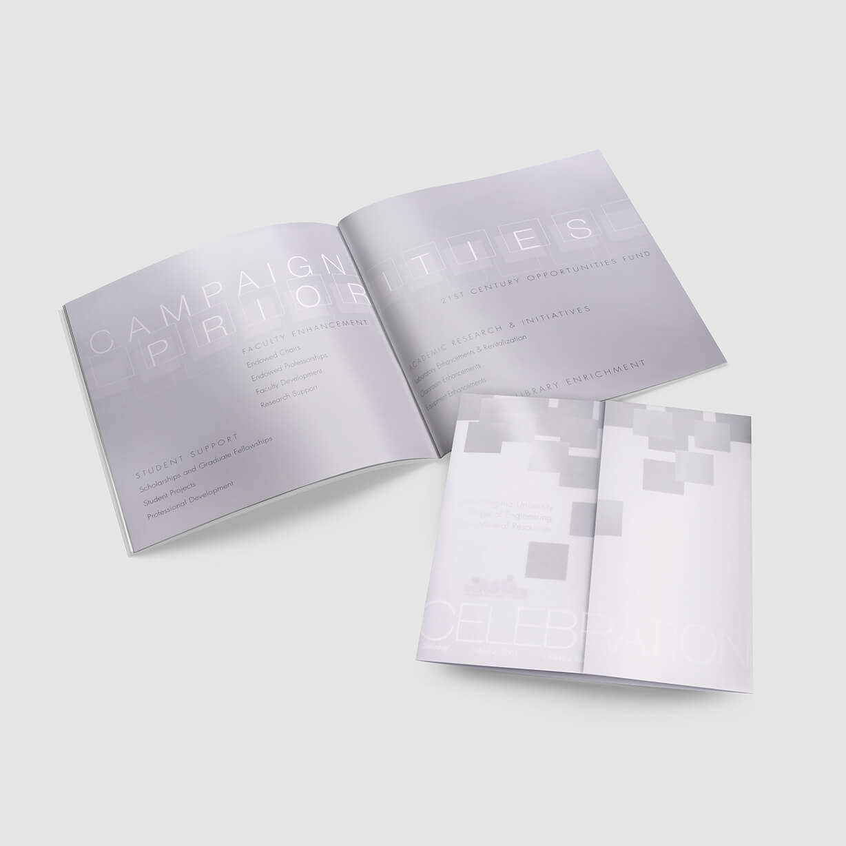
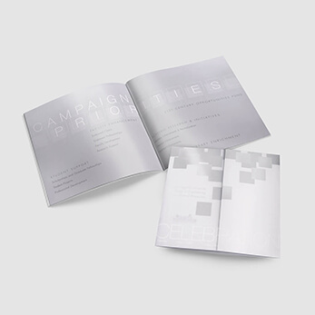
West Virginia University’s Capital Campaign Kick-off Mailer
If you have an event, make it stand out by communicating with an aggressively designed invitation. Using quality designers to make your ideas come to life sets the tone for your event. In contrast, if you accept just any design, your event will lack interest and will actually act as a hurdle to convincing your prospects to participate in your event.


