Our Killer Brochure Design Attracts Your Audience
Talented designers. Gorgeous, brand-aligned creative work. Our portfolio showcases successful projects that blend creativity and strategy. Join us to explore innovative design solutions tailored to your needs.
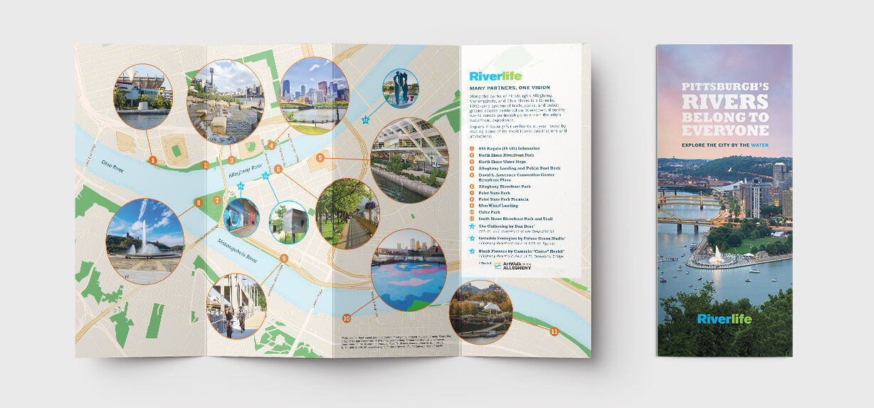
Flowing Waters, Flourishing Life: A Celebration of Our Rivers on This Nonprofit Brochure
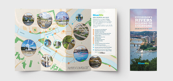
Visit Pittsburgh’s beautiful riverfront.
Shown is a super-clean city illustration with photo insets of popular stops along the 3 rivers. The brochure’s map was custom-created by Direct Axis.
Designing the Riverlife 8-Panel Brochure
Creating the 8-panel brochure for Riverlife was a dynamic process that balanced compelling visual storytelling with functional design. Our goal was to craft a piece that would not only inform but also inspire locals and visitors to explore Pittsburgh’s riverfronts. The design process unfolded in several key stages, ensuring that the final product met Riverlife’s vision while maintaining clarity, accessibility, and aesthetic appeal.
1. Research & Concept Development
We worked closely with Riverlife to ensure that our design aligned with their content and mission, capturing the essence of these spaces as vibrant community assets. Our team brainstormed different layout structures to optimize readability while making space for visually engaging elements.
2. Structuring the 8-Panel Layout
Designing an 8-panel format required strategic organization. We explored various folding techniques to ensure that information was presented logically and intuitively. The sequence of the locations had to flow seamlessly with the reader’s natural interaction with the panels. The brochure’s layout emphasized hierarchy, with larger headers for each stop, engaging subheadings, and easy-to-digest descriptions.
3. Crafting the Bird’s-Eye View Map
A standout feature of the brochure is the custom bird’s-eye view map illustration. This required a meticulous approach to accuracy and artistic representation. Our team developed initial sketches, ensuring key landmarks were easily recognizable while maintaining a clean and visually appealing design. The map serves as both a functional navigation tool and a striking centerpiece, visually connecting all 11 stops in a cohesive manner.
4. Visual Aesthetic & Branding
Riverlife’s branding and the natural beauty of the riverfronts guided our color palette and typography choices. We used a mix of blues and greens to reflect the waterfront setting, with warm accent colors to highlight key features. A combination of modern and easy-to-read typefaces ensured accessibility for a wide audience. High-quality photography and subtle graphic elements complemented the text, bringing the experience of the riverfronts to life.
5. Finalizing & Print Production
Once the design was refined and approved, we carefully prepared it for print production. Given the 8-panel format, precise folding and alignment were critical to maintaining a polished look. We worked closely with the printing team to ensure the colors remained vibrant and the paper quality enhanced durability and usability. The final result was a beautifully crafted brochure that effectively showcases Pittsburgh’s riverfronts, making it an inviting and informative guide for visitors and locals alike.
Ride the Rapids: Thrilling Adventures Await in Our White Water Rafting Brochure
Deliver an Exciting Message to Your Prospects
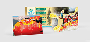
Want some action in your brochure design? We created this brochure to communicate fun to adventure seekers. This brochure has a die-cut for an extra level of interest, but it’s only slightly higher in cost than a typical brochure. Well worth the extra cost..
Real Estate Investment Brochure Design: From blank Canvas to Investor-ready
Read About Our Four-phase Approach that Turns Complex Financial Data Into a Compelling Visual Story
Here’s a look at how we brought this brochure to life
Phase 1 — Discovery & Audience Research
Before a single pixel hits the canvas, we sat down and really worked with our client to find out what makes a real estate financial investor tick. What are they worried about? What makes them lean forward? We studied the investment strategies, the risk profiles, and the kind of credibility signals that resonate with high-net-worth decision-makers. This upfront work is what separates a brochure that looks nice from one that actually moves people.
Phase 2 — Content Strategy & Data Architecture
With that knowledge in hand, we mapped out the content like a story. We worked with our client to decided which financial strategies should lead the narrative, which charts and graphs would carry the heaviest lifting. Every bullet point, every section header was planned with intention.
Phase 3 — Visual Design & Data Visualization
We built a color palette that says “trustworthy and sophisticated” without being stuffy. The charts and graphs were designed from scratch — not pulled from a spreadsheet — so they feel editorial and intentional. We obsessed over typography, spacing, and making sure dense financial data never felt overwhelming on the page.
Phase 4 — Review, Refinement & Production
Great design is a conversation, so we built in structured review rounds with the client to tighten everything up. Every data point was fact-checked, every chart verified. Then we prepared the final files for both print production and digital distribution, so the brochure looks just as sharp on screen as it does in someone’s hands.
Nonprofit Corporate Sponsorship Brochure
Read More About Our Design Process: Bringing Your Mission to Life
Every great brochure starts with a great conversation. Before we open a single design tool, we sit down (virtually or in person!) to learn everything we can about your nonprofit — your mission, your impact, and the corporate partners you’re hoping to attract. That discovery phase shapes every creative decision we make from that point forward.
Once we understand your story, our team gets to work translating it into a visual strategy. Here’s what that looks like in practice:
Brand deep-dive — We review your existing logo, colors, and messaging to make sure the brochure feels like you, not a generic template.
Audience mapping — We think carefully about what corporate sponsors care about: ROI, visibility, community impact, and credibility. Every design choice speaks directly to them.
Content architecture — We organize your key messages — programs, stats, testimonials, giving tiers — into a clear, compelling flow that guides the reader naturally.
Visual concepting — Our designers develop 2–3 distinct creative directions for you to react to, ranging in style and tone.
From there, collaboration is everything. We share initial concepts with you, gather your feedback, and refine until every page feels just right. We’re not happy until you’re happy — and we make the revision process easy and stress-free, never rushed.
The final result? A polished, print-ready (and often digitally optimized) brochure that makes your nonprofit look every bit as impactful as it truly is — and gives corporate sponsors every reason to say yes.
Our Creative Process
Step 1
We gather your ideas and goals to align on vision.
Step 2
We provide a written quote and prodcution schedule.
Step 3
Our team drafts initial concepts to visualize your brand.
Step 4
We refine the selected designs based on your feedback.
Step 5
The final designs and printed material (if needed) are delivered for your approval.
Nonprofit Impact Report Design
Here's a Deep Look at Our Design Process for the Hospital Impact Report
Getting to Know the Story
Every Impact Report starts with listening. We sat down with the marketing team to understand their mission, their wins from the past year, and the communities they serve. For a project rooted in Haiti — a place with such a rich and resilient culture — it was especially important that the story felt authentic and human, not just like a collection of statistics.
Shaping the Narrative
- Mapped out all 10 panels to ensure a natural flow — from mission and context to data, stories, and a forward-looking call to action
- Identified key impact metrics (patients served, procedures performed, community outreach) that deserved visual emphasis
- Worked with the client to surface 2–3 human stories that would anchor the emotional core of the report
- Organized content so donors and stakeholders could absorb the impact quickly, even at a glance
Bringing the Design to Life
With the content architecture in place, we moved into visual design. We developed a palette and typographic system that felt warm and grounded — drawing subtle inspiration from Haitian art and color tradition while maintaining the professionalism donors expect. Photography was central to every panel, paired with clean data visualizations that made the numbers feel tangible and real.
- Designed custom infographics for key stats so data never felt cold or abstract
- Used full-bleed imagery to create emotional connection across the panels
- alanced white space carefully so the report felt premium without feeling sparse
- Ensured every design choice served the story, not the other way around
Refining Until It Shines
We went through several rounds of collaborative revisions with the hospital’s communications team, fine-tuning everything from headline phrasing to color contrast. The final 10-panel report was delivered print-ready and export-optimized for digital sharing — because a great Impact Report shouldn’t just sit in a drawer. It should open doors, inspire giving, and make the people behind the mission proud.
From Blueprint to Reality: See the Excellence in Our Home Builder’s Brochure
8 Beautiful Matching Brochures
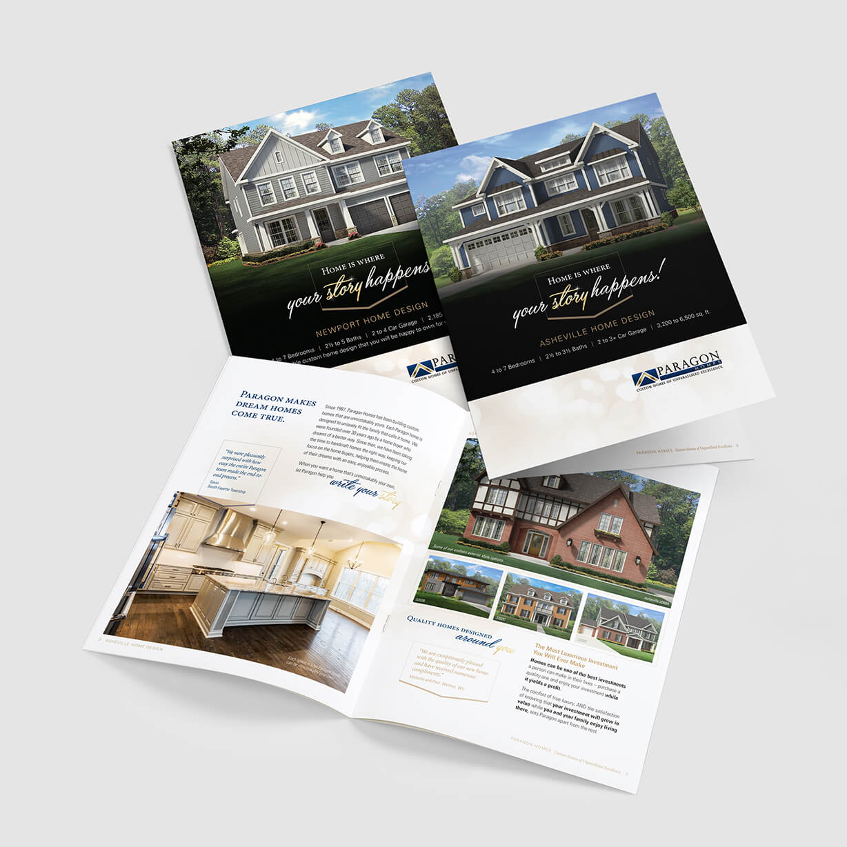
Shown are 3 cover designs and an interior spread. Cleanly Photoshopped images and an easy-to-follow layout were used to show off the talent of Paragon Home Builders. The interior pages include graphically-highlighted areas that help the reader focus on the important features of the homes. This series of brochures included 8 versions.
Industrial Ingenuity in Print: Explore Our Innovative Brochure Design
Manufacturing isn’t Boring to Us – it’s Active and Vibrant!
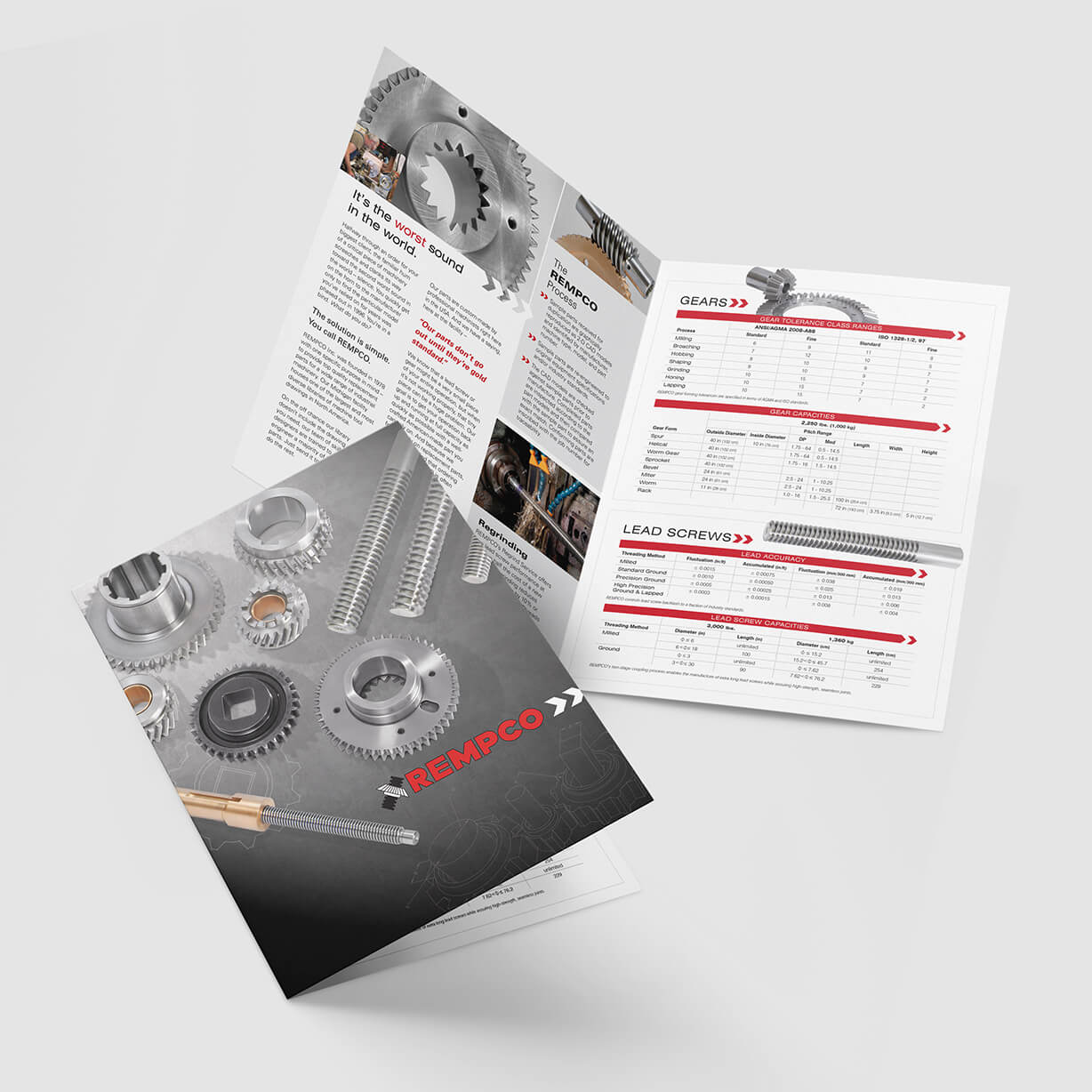
Dispel the myth that manufacturing brochures are dull and boring – use clean imagery and well-thought-out text to get the attention of your buyers. The 4-panel brochure shown was designed for a machine shop that produces top-of-the-line gears and replacement parts. The high quality brochure implies that the manufacturer is high quality too.
A Program Booklet Design That Educates and Engages
Humane Education for Every Grade Level
We designed a 12-page program booklet that transforms Animal Friends’ humane education offerings into a compelling, easy-to-use resource for educators. The booklet supports classroom learning, reinforces compassion, and drives program bookings—while staying true to a playful, child-focused theme.
Our Design Process
Strategic Content Mapping
We structured the booklet to mirror how teachers evaluate programs—by grade level, learning outcomes, and ease of booking. Content was intentionally sequenced to move readers from discovery to action.
Theme-Driven Visual Design
The design was inspired by “Tails & Whiskers: Reading and Caring Adventures,” using friendly illustrations, energetic color palettes, and storytelling elements that appeal to children while remaining credible for educators.
Grade-Level Differentiation
Distinct visual cues help educators quickly identify programs for:
Kindergarten & 1st Grade
2nd & 3rd Grade
4th & 5th Grade
This clear segmentation improves usability and speeds decision-making.
Engaging Educational Layouts
Each program spread balances imagery, book highlights, and concise descriptions to keep information approachable and visually engaging—ideal for busy teachers.
Clear Calls to Action
Strong, well-placed calls to action encourage educators to book a school program and schedule a classroom visit with an Animal Friends representative and their pet.
Flexible, Future-Ready Design
The booklet was built with a modular layout system, making it easy to expand as new books or programs are added.
Let's Bring Your Vision to Life
Your project deserves the best. Our team is ready to help you create stunning designs that reflect your brand’s identity. Whether you’re looking to create captivating print materials, build a new website or refresh your logo, we’re here to assist. Don’t hesitate to reach out to us for any inquiries or to start a project together.
Culinary Dreams and Picture-Perfect Moments: Our Catering & Wedding Venue Brochure Designs
Matching Brochures for Catering and Event Venues
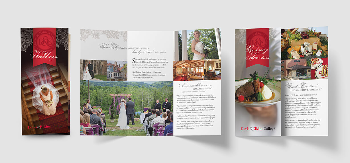
Your prospective customers will be licking their lips and choosing your venue when they are presented with a brochure that shows off your best assets. Fickle brides will be impressed and move to a purchase decision. Use a brochure design that attracts them and convinces them that you’re the right vendor for them.
Through the Lens of Love: Unveiling Fabulous Wedding Photography in Our Brochure
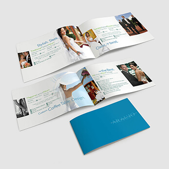
Clean and contemporary describes this wedding brochure, designed for Araujo Photography. Pittsburgh weathermen and news anchors are featured weddings
Common Questions
Your questions answered about brochure design.
The design timeline varies based on the project scope. Typically, it can take anywhere from a few days to several weeks. We aim to communicate clearly and keep you updated throughout the process.
Of course you can make changes. We typically allow for multiple revisions during the design phase. Your feedback is crucial, and we want to ensure that the final product reflects your vision.
Your finalized brochure will be delivered in both print-ready format and a digital version. We print brochures as needed. Ask for a printing quote.
Generally, all of our brochures are created using Adobe’s Creative Suite (Illustrator, InDesign, Photoshop, etc.). We also create using Canva on your account or ours.