Our Work
Branding your Business or Nonprofit for Recognition
We redesign, organize and communicate your brand vision to your prospects and clients.
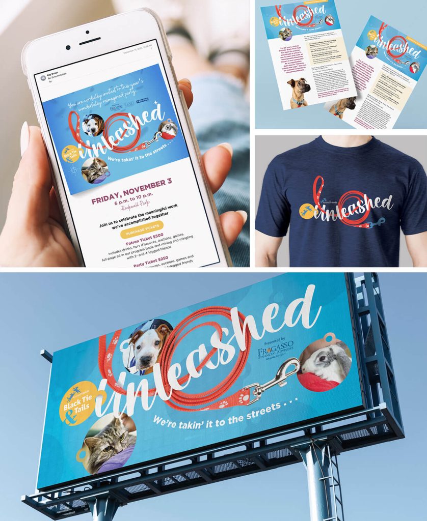
Branding Campaign for a Nonprofit Animal Welfare Event: Signage, Wearables, Digital Media, Print
Open for a Description of the Branding Processes
The “Unleashed” event branding we created is dynamic, bold, and celebratory, reflecting the joy and freedom pets feel when they find their forever homes. The design features vibrant visuals, playful typography, and cohesive messaging that positions the event as a must-attend occasion for animal lovers. A stylized leash intertwined with pet images symbolizes freedom and new beginnings.
Our design concept included a stylized leash intertwined with pet images to convey excitement, movement, and freedom. Campaign components were used on billboards, t-shirts, flyers, web pages, email invitations, social media ads.
The headline typography is a bold, modern brushstroke-style. It is combined with sans-serif fonts for readability.
Cohesive Branding: All components share a consistent design language, including colors, fonts, and imagery, making the campaign instantly recognizable.
Dynamic Energy: Motion-inspired visuals give a sense of action and joy, aligning with the event theme.
Emotional Appeal: Warm, playful imagery connects with the audience on a personal level, encouraging attendance and participation.
By focusing on bold, celebratory designs and cohesive messaging, the “Unleashed” campaign effectively communicates the excitement and purpose of the event while enhancing Animal Friends’ brand identity.

Branding for a Real Estate Investment Firm: Brochures, Pocket Folders, Letterhead, Business Cards, Sell Sheets
Open for a Description of the Branding Processes
Our branding campaign for a real estate investment firm was designed to project authority, trust, and sophistication while appealing to seasoned and first-time investors alike. Each element—The Capital Playbook, pocket folder with inserts, flyers, and business cards—was thoughtfully designed to create a cohesive and visually impactful brand identity. The design balances professionalism with accessibility, ensuring the materials resonate with both institutional investors and individual clients.
Design Philosophy
Core Values: The design reflects the firm’s expertise, reliability, and forward-thinking approach.
Visual Tone: Sleek, modern, and polished with a subtle touch of approachability.
Color Palette:
A refined combination of navy blue (symbolizing trust and stability) and bright cyan (representing prosperity and success). Accents of white and gray provide balance and a clean, professional feel.
Design Features:
Infographics, such as ROI charts and property investment timelines, designed with a modern, minimalist aesthetic.
Vibrant headings and icons paired with concise, well-organized content for easy scanning. A consistent use of the color palette and typography across all inserts for brand unity.
Clear calls-to-action (e.g., “Download The Capital Playbook” or “Contact Us for a Consultation”).
Double-sided design on the business cards printed on premium materials: Thick card stock with a soft-touch matte finish
Why This Campaign Stands Out
Cohesive Branding: Every component shares the same design language, creating a unified identity that reinforces the firm’s professionalism and expertise.
Instant Visual Recognition: The sophisticated use of color, typography, and premium finishes ensures the brand stands out in a competitive real estate investment market.
Practical and Elegant: The materials are not just visually appealing but also functional, offering clients clear, organized information to support their investment decisions.
Memorability: The premium finishes and high-quality materials leave a lasting impression, aligning with the firm’s promise of high-value investments.
This branding campaign positions the company as a trusted partner in wealth creation, blending thoughtful design with strategic messaging to create materials that are as impactful as they are functional.
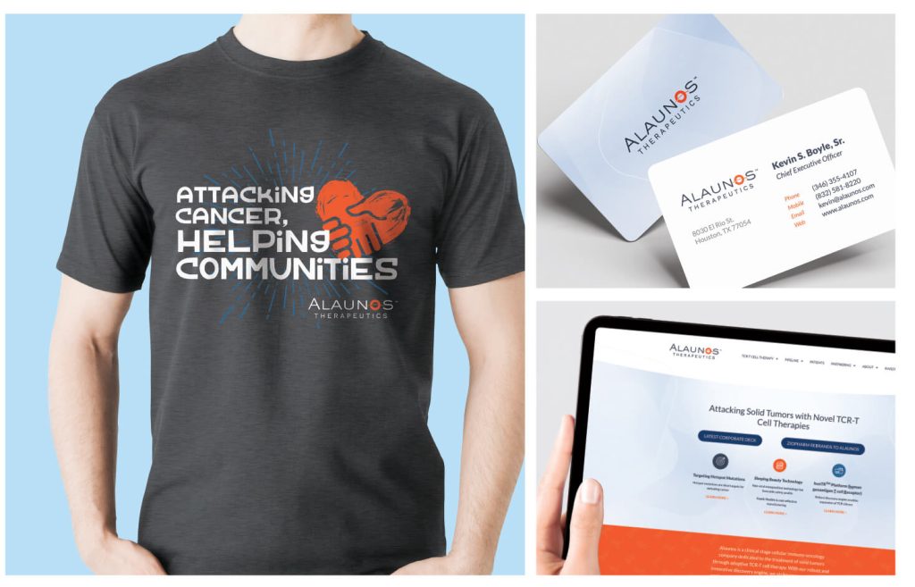
Alaunos Therapeutics Total Corporate Make-over: Website, Letterhead, Business Cards, Wearables
Open for a Description of the Branding Processes
The rebranding of Alaunos, a biotech company specializing in cancer cell therapy, was designed to reflect innovation, precision, and hope. The brand identity balances technical sophistication with human-centric elements, underscoring Alaunos’ mission to transform cancer care. Every component—logo, website, and corporate identity—was meticulously crafted to ensure instant recognition and resonate with both scientific and general audiences.
Design Philosophy
Core Concept: The new brand identity centers on progress, precision, and empowerment, representing Alaunos’ role in advancing cancer cell therapy and inspiring hope for patients.
Visual Tone:
Modern and innovative, reflecting cutting-edge biotechnology. Clean and approachable, emphasizing trust and care.
Color Palette:
A combination of deep blues (signifying trust, professionalism) and vibrant orange (symbolizing growth and healing), complemented by neutral grays for balance.
Key Components
Logo
The logo achieves instant recognition by merging scientific elements with a sleek, minimalist design. Its flexibility ensures it is impactful across digital, print, and environmental applications.
Website
Design Approach:
A streamlined layout prioritizing usability and accessibility.
Large hero sections featuring inspiring imagery and infographics to explain complex science in a digestible way.
Website Features:
A consistent visual system with the logo, typography, and color palette.
Clear navigation and intuitive structure, allowing audiences to explore Alaunos’ breakthroughs, mission, and scientific partnerships.
Content Style:
Balances technical precision with approachable, empathetic messaging.
High-impact calls-to-action (e.g., “Learn About Our Breakthroughs” or “Partner With Us”).
Corporate Identity Components
Stationery:
Letterheads, business cards, and envelopes were designed with subtle textures, ensuring a tactile and visual connection to the brand. A clean and professional layout using the brand’s typography and logo for consistency.
Presentations and Reports:
Custom-designed templates for PowerPoint decks featured cohesive layouts, bold headings, and engaging visuals. Use of the color palette to segment sections and highlight data, making content easy to digest.
Employee Wearables:
Subtle, branded apparel such as t-shirts, polos and jackets with embroidered logos maintained professionalism and approachability.
Cohesion Across Touchpoints: Every element—logo, website, and identity materials—is designed to reinforce Alaunos’ brand values, creating a seamless experience for stakeholders.
Visual Recognition: The bold yet minimalist design ensures that Alaunos stands out in the competitive biotech space, while its approachable style fosters trust among patients and partners.
Scalability: The branding is adaptable across multiple formats, from digital screens to print and physical environments, ensuring consistent impact.
By prioritizing thoughtful, research-driven design, the Alaunos brand makeover effectively positions the company as a leader in cancer cell therapy while creating an emotional connection with its audience.
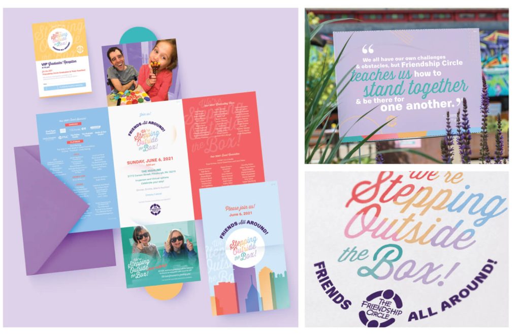
Event Branding for a Nonprofit: Invitations, Signage, Digital Media

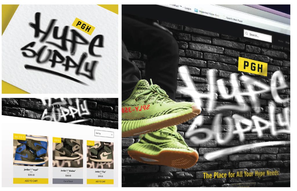
Branding Example for a Retail Meat Market: Signage, Wearables, Digital Media
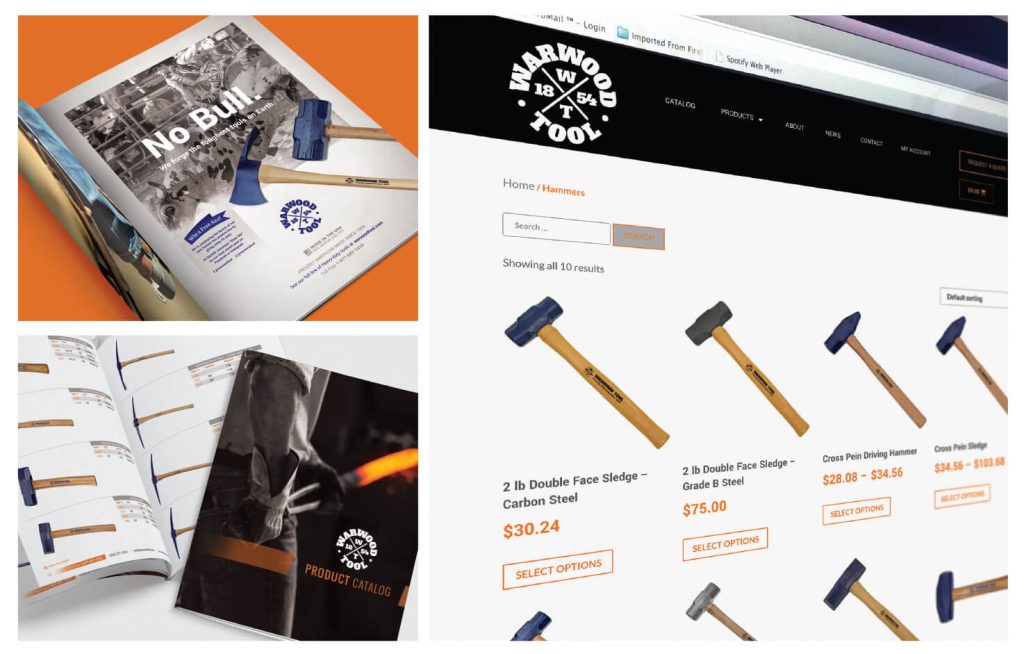
Rebranding Including: ECommerce, Print Catalogs, Advertising

Magazine/Newsletter Branding for a Nonprofit
Logo and Website Rebranding
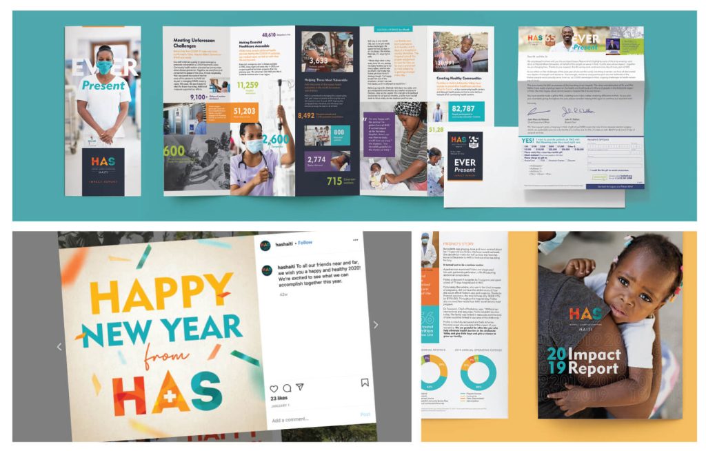
Social Media, Fundraising Direct Mail, Annual Impact Reports
Our Branding Process, Simplified
Step One
We begin with an in-depth consultation to understand your vision.
Step Two
Next, we create tailored design concepts that reflect your brand.
Step Three
After feedback, we refine the designs to ensure they meet your needs.
Final Step
We produce and deliver all assets, print & digital, for your branding success.
Elevate Your Brand
Transform your vision into reality with our design expertise.
- Custom branding solutions tailored to your needs.
- Stunning web designs that captivate and convert.
- Innovative print media that leaves a lasting impression.