
Print Design for the Healthcare Industry
See our successful projects that blend creativity and strategy. Explore our innovative medical brochure design solutions.
Medical Brochures, Pocket Folders and Catalog Design
Present an image of reliability and quality to your current or prospective patients or buyers with beautifully-designed medical brochures, pocket folders or catalogs. Click on the brochure image below to see more detail.
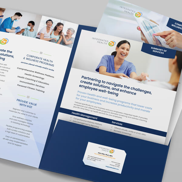
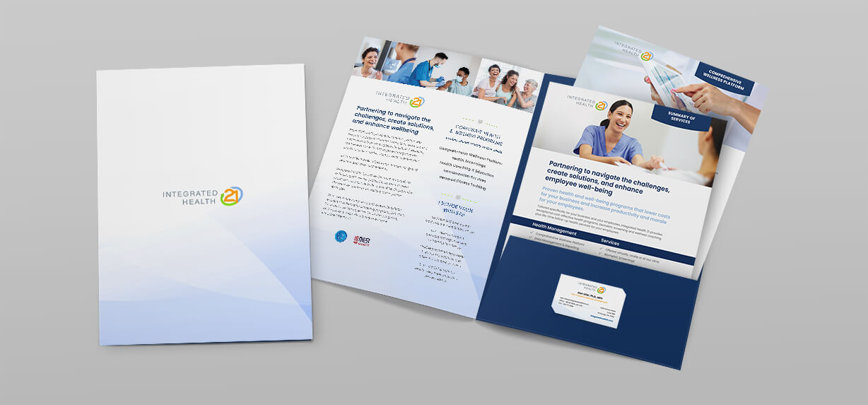
Pocket Folder & Inserts for a National Health Company
Our creative firm approached this project with the goal of crafting materials that not only reflected the company’s expertise but also provided flexibility in presenting their services to various audiences.
Open to See the Planning Process
Research and Content Development
We began by thoroughly understanding Integrated Health 21’s offerings, target audiences, and key messaging. This involved discussions with their team to identify the core services they wanted to highlight — such as wellness programs, biometric screenings, and population health management. Our copywriters then crafted content that was concise yet impactful, ensuring each insert clearly explained a service while maintaining a consistent tone across all materials.
Structuring the Inserts
To maximize usability, we developed multiple inserts that could be customized based on client needs. Each insert focused on a single service or solution, making it easy for the sales team to tailor their presentations. Key elements of the inserts included:
- Headlines and subheadings that quickly conveyed benefits and outcomes.
- Bullet points to highlight features and streamline complex information.
- Client success stories and testimonials to build credibility.
Pocket Folder Design
The pocket folder was designed to be both functional and visually striking. Our design team ensured the exterior reflected Integrated Health 21’s branding — using their color palette, logo, and clean graphics — while the interior included organized pockets to neatly hold the inserts. We also added a business card slot for easy contact sharing.
Collaboration and Revisions
We worked closely with Integrated Health 21 throughout the process, gathering feedback at each stage. This collaborative approach ensured that both the copy and design aligned with their brand voice and strategic goals. Adjustments were made to fine-tune messaging, adjust layouts, and ensure all materials worked seamlessly together.
Final Outcome
The completed pocket folder and inserts offer Integrated Health 21 a versatile tool for client meetings, conferences, and mailings. The modular design allows their team to present targeted information effectively, while the polished visuals and compelling copy strengthen their professional image. This project highlights our ability to create adaptable, high-impact materials tailored to the needs of healthcare businesses.
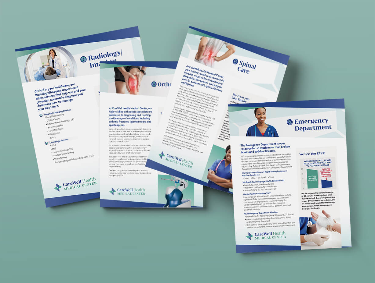
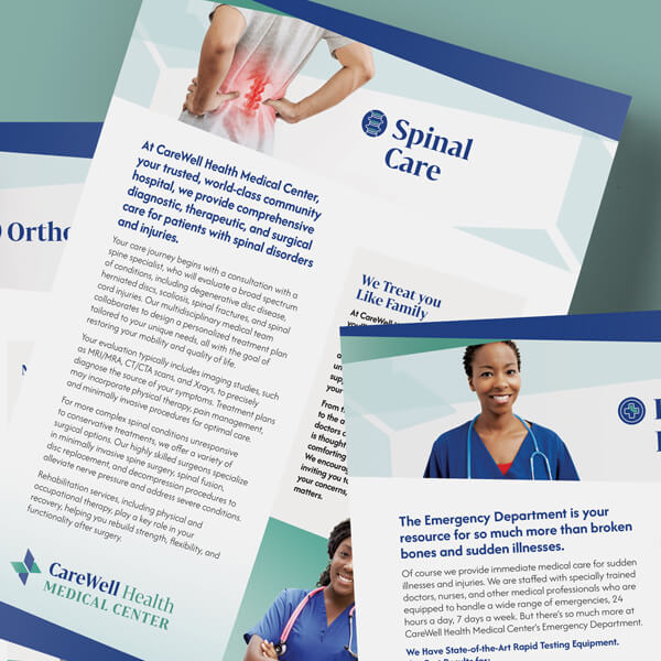
Pocket Folder Inserts for a Community Hospital
The pocket folder inserts for CareWell Health Medical Center were designed to provide critical information in an engaging and visually appealing format. Each flyer highlights a specific department—Spinal Care, Emergency Department, Orthopedics, and Radiology—with content developed after in-depth interviews with department stakeholders. The result is a series of inserts that are easy to read, visually striking, and reflective of CareWell Health Medical Center’s commitment to patient-centered care.
Open to See the Planning Process
Core Goals:
Clarity: Present complex medical information in an easily digestible format for patients and families.
Visual Interest: Create an aesthetic that reflects professionalism while remaining warm and approachable.
Consistency: Ensure all inserts share a cohesive look while allowing each department to have its own unique identity.
Key Components:
Content Development Interviews: Each department’s insights were captured through interviews with medical professionals, ensuring the content reflects real expertise and addresses common patient concerns.
Patient-Centered Language: Medical jargon was simplified into plain, conversational language to ensure accessibility for diverse audiences.
Key Sections:
- Overview of the department and its services.
- What patients can expect during their visit or treatment.
- Frequently asked questions tailored to each department.
- Contact information and next steps.
Design Features:
Modular Layout Design:
Content is segmented into clear sections with distinct headers for easy navigation. Callout boxes highlight key points
Typography
Readable Fonts: A clean sans-serif font for body text paired with a bold serif typeface for headers. Font sizes optimized for clarity, with headings standing out for easy scanning.
Color Palette:
Inspired by CareWell Health Medical Center’s branding, a calming color scheme of blues and greens with complementary accents to differentiate each department:
Icons:
Custom icons for quick visual cues (e.g., a spine graphic for Spinal Care).
Standardized Dimensions: Inserts fit perfectly into CareWell’s pocket folders for easy organization and portability.
Why It Works
Ease of Use: The modular layout and clear typography make information quick to scan and understand.
Visual Interest:
Calming colors, professional imagery, and engaging graphics draw attention while reinforcing CareWell’s brand identity.
Tailored Content:
Interviews with stakeholders ensured that each insert reflects the unique needs and strengths of its respective department, offering value to both patients and staff.
Professional Cohesion:
While each flyer has its own identity, the consistent branding ties them together as a unified representation of CareWell Health Medical Center.
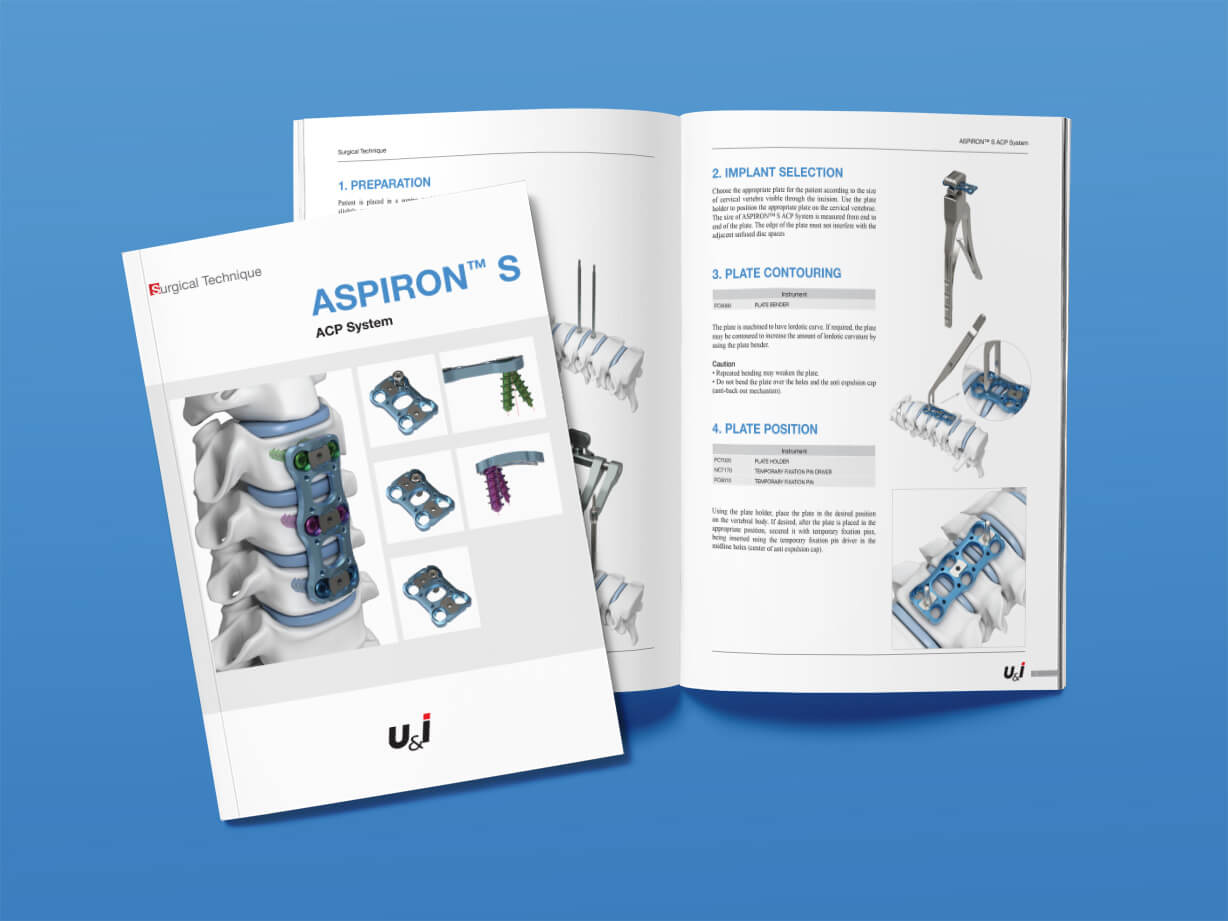
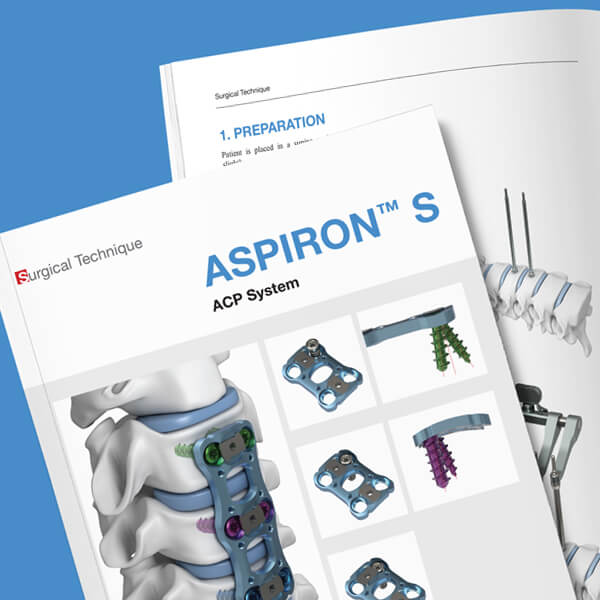
Healing with Style: The Artistry Behind a Well-Designed Medical Instrument Catalog
The 20-page medical device catalog was meticulously designed to showcase spinal fixation devices, which play a critical role in the treatment of fractures, degenerative diseases, infections, tumors, and congenital deformities like scoliosis. The primary goal of the catalog was to present these highly technical devices with clarity and precision while maintaining a clean, professional design that reflects the quality and reliability of the products.
Open to See the Design Process
Design Process:
Discovery and Planning:
The first step was understanding the client’s needs and the audience for the catalog.
Client Goals:
The client emphasized the importance of a clean, professional layout and intuitive navigation, allowing surgeons and medical professionals to easily find product information.
Audience Insights:
Since the catalog would be used by highly skilled medical professionals, the design needed to balance technical detail with visual clarity, avoiding unnecessary clutter.
Content Mapping:
Collaborated with the client to organize the content, defining key sections such as product overviews, technical specifications, usage guidelines, and ordering information.
Concept Development:
Visual Style:
Developed a clean, modern aesthetic with ample white space to ensure the focus remained on the devices and their details. A subtle color palette of blues and greys was chosen to evoke professionalism and trustworthiness.
Typography:
Selected highly legible sans-serif fonts for headings and body text to ensure readability, even for complex technical information.
Illustrations and Photography:
Device Illustrations:
Our client partnered with medical illustrators to create detailed, high-quality renderings of the spinal fixation devices, ensuring accuracy and clarity. These illustrations highlighted key features such as design, size, and material composition.
Photos:
Where applicable, incorporated close-up photos of the devices in clinical settings, showcasing real-world applications.
Page Layout and Navigation:
Section Organization:
Divided the catalog into clear sections for easy navigation, including a table of contents and section dividers with color-coded tabs for quick reference.
Design Refinements:
Conducted multiple rounds of client feedback, refining details such as image placement, font sizes, and the balance between text and visuals.
Ensured a consistent visual hierarchy across all pages, with intuitive flow and clear differentiation between headings, subheadings, and body text.
Integrated small design elements, such as subtle gradients and icons, to enhance visual appeal without overwhelming the content.
Key Features of the Final Catalog:
Clean, Modern Design:
A professional and uncluttered layout that prioritizes clarity and accessibility.
Clear Illustrations:
High-quality, detailed renderings of devices with annotated callouts for key features.
Easy Navigation:
Color-coded sections, a detailed table of contents, and consistent layouts made it simple for readers to locate and compare products.
Technical Precision:
Carefully presented product specifications in an organized, grid-based format to meet the needs of medical professionals.
Outcome:
The final catalog achieved the perfect balance between technical detail and aesthetic appeal, serving as a trusted resource for surgeons and other medical professionals. It reflected the precision and innovation of the spinal fixation devices while making it easy for users to explore and understand the product offerings.
Our Creative Process
Step 1
We gather your ideas and goals to align on vision.
Step 2
We provide a written quote and prodcution schedule.
Step 3
Our team drafts initial concepts to visualize your brand.
Step 4
We refine the selected designs based on your feedback.
Step 5
The final designs and printed material (if needed) are delivered for your approval.
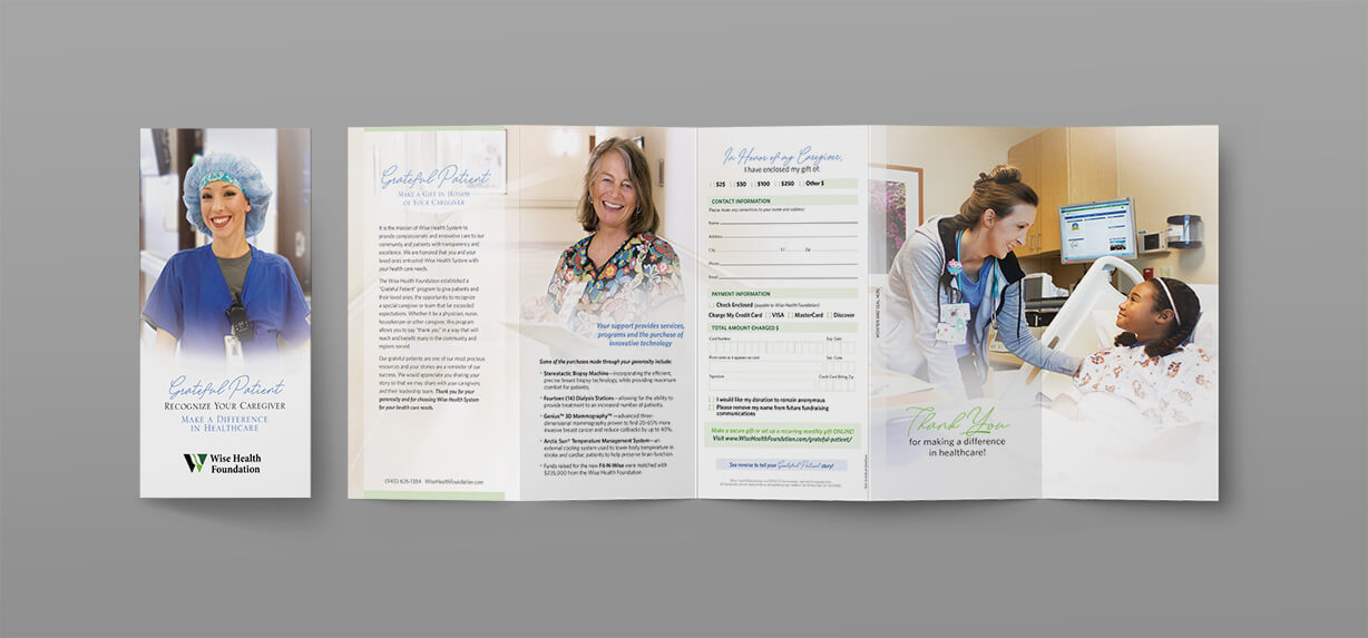
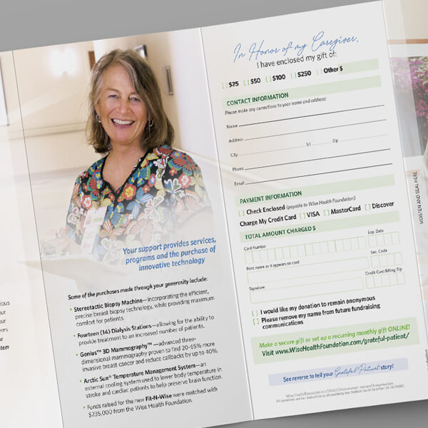
Shining Stars: A Hospital Brochure Design Created to Celebrate Employee Excellence
The brochure shown is used to acquire feedback from patients as well as to acquire new donors to the hospital foundation.
Open for a Description of the Employee Excellence Brochure Design
Designing a hospital brochure, especially one focused on “Employee Excellence,” involves a thoughtful, patient-centered approach. Here’s a breakdown of how we created the brochure shown above:
Understanding the Purpose
First, we clarified the goal of the brochure — in this case, encouraging patients to nominate healthcare workers for exceptional care. It’s crucial to strike an emotional yet professional tone that inspires trust.
Content Development
We collaborated with the hospital’s team to craft clear, concise text. The content explained the nomination process, why recognizing staff matters, and how to fill out the form. We also included a heartfelt introduction can make the piece feel more personal.
Form Design
The nomination form was created to be intuitive. The form:
- Had clear labels for patient information and staff details
- A dedicated area for the patient’s story or feedback
- Checkboxes for quick selections
Visual Design
The design reflected the hospital’s brand — clean lines, a calming color palette (blues, greens, or neutral tones), and plenty of white space.
- Elegant fonts that balance professionalism and warmth
- Subtle graphics to guide the eye without cluttering the layout
- A visually distinct call-to-action, prompting patients to submit their nominations
Patient-Friendly Layout
We ensured readability with large-enough fonts and accessible language. We considered patients’ emotional state — simplicity and empathy in design and wording matter.
Review and Feedback
We worked closely with the hospital’s HR and PR team, ensuring the design aligned with their values.
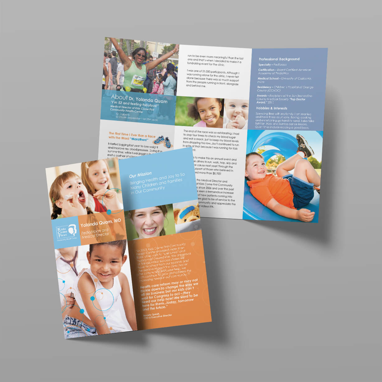
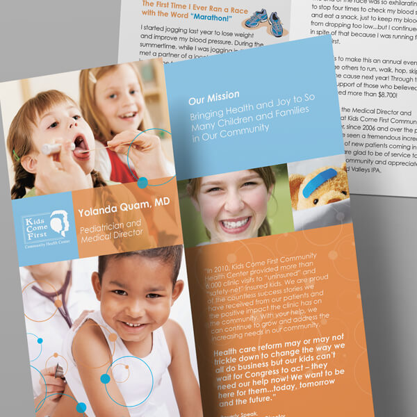
Colorful and Creative: The Art of Fun Pediatric Brochure Design
Used as Mailers and Hand-Outs
Inform patients and caregivers about your medical facility and capabilities. The brochure shown was designed for a pediatric physician. Individual brochures were created for each physician in the healtcare concern.
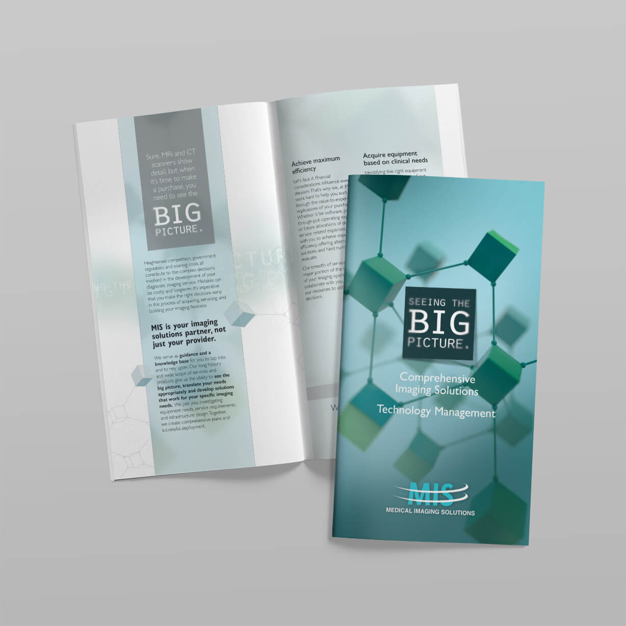
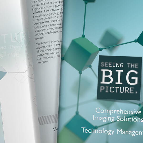
Innovation in Focus: Designing a Medical Imaging Brochure
Imaging Equipment Brochure
Businesses in health care hire us to create capabilities brochures with graphic design that impresses and attracts new clients. This medical brochure was used to describe imaging equipment offerings for hospitals. The brochure is hand-delivered by sales representatives, sent via direct mail and given out at trade shows.
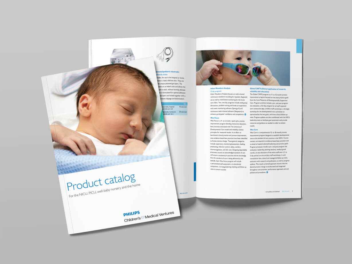
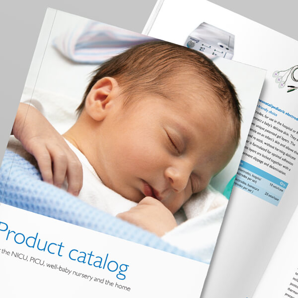
Innovative Solutions for New Beginnings: A Catalog Design Tailored to NICU, PICU, and Well-Babies
The catalog sample shown was designed using Philips’ brand standards. Our graphic designers can follow your brand guidelines or create a unique new design for your catalogs.
Let's Bring Your Vision to Life
Your project deserves the best. Our team is ready to help you create stunning designs that reflect your brand’s identity. Whether you’re looking to create captivating print materials, build a new website or refresh your logo, we’re here to assist. Don’t hesitate to reach out to us for any inquiries or to start a project together.
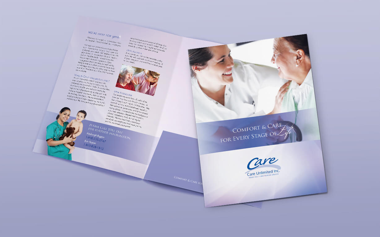
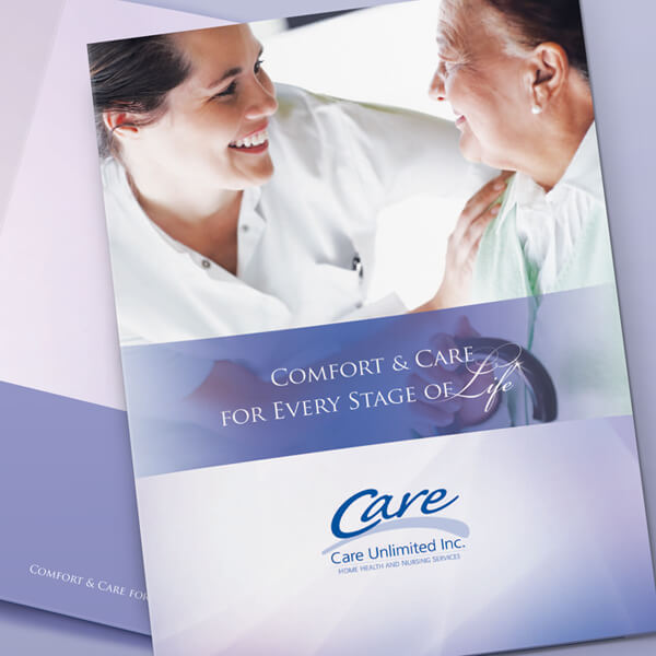
Home Healthcare Information, Neatly Organized: Elevating Your Brand with Pocket Folder Design
We create posters, billboards and pocket folders for healthcare businesses. Shown is an example of a Pocket Folder we created for a home healthcare agency. We also created a matching website.
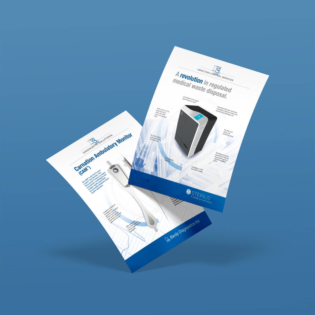
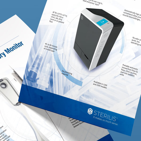
Medical Flyers: Clean Design for Infection Control and Diagnostics Products
Open to See the Design and Planning Process
Infection Control
Design goals
- Convey cleanliness and clinical precision
- Bold iconography for hygiene protocols
- High-contrast palette (grey, white, deep navy)
- Clear hierarchy — captions for descriptions made prominent
- Readable at a glance in healthcare settings
Diagnostics Products
Design goals
- Communicate precision and technical authority
- Product-forward layout with supporting data
- Cool blue palette with white space for focus
- Structured sections for specs and benefits
- Professional tone for clinical buyers
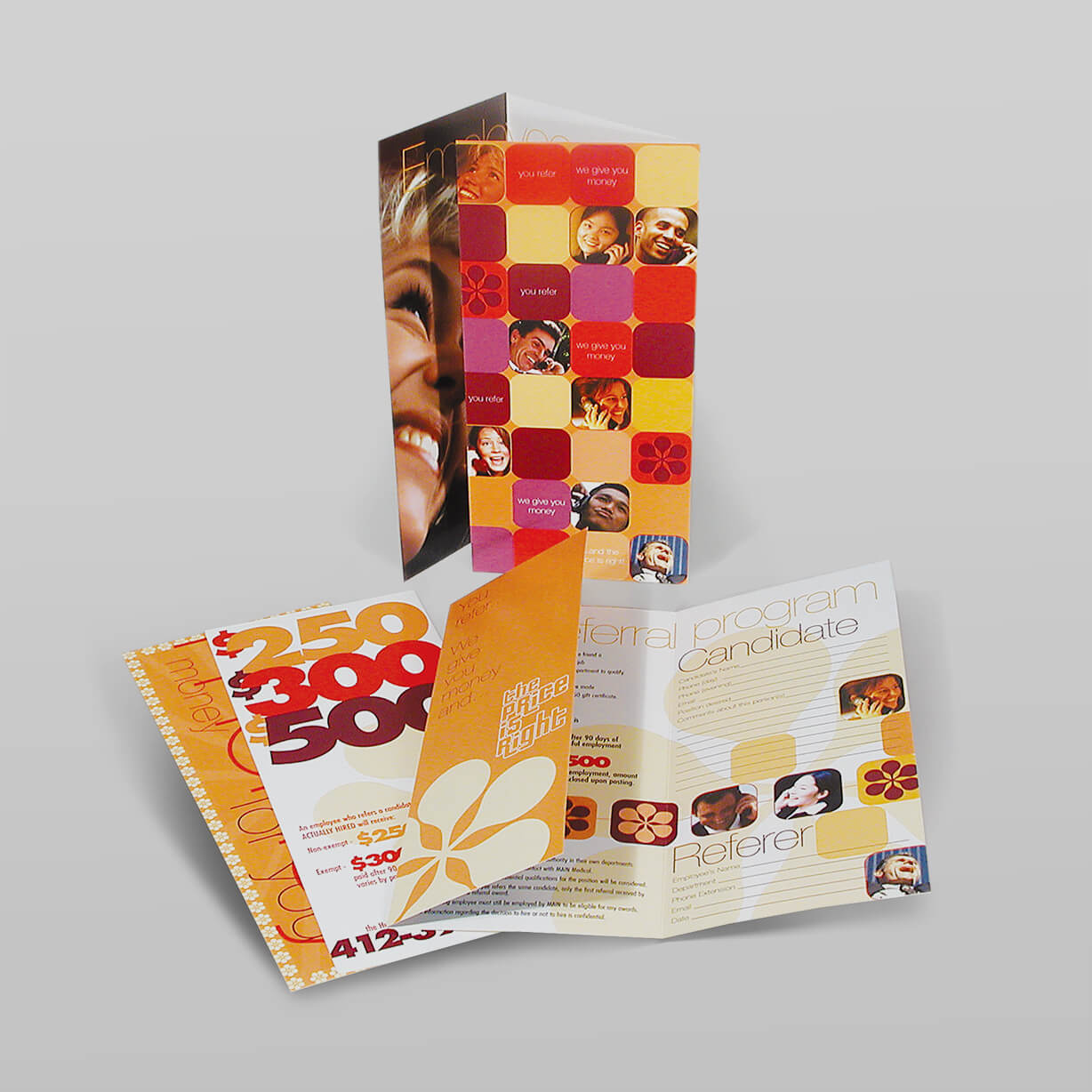
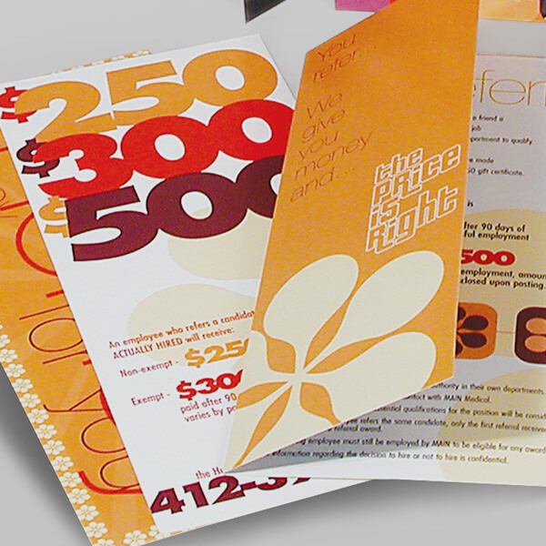
Your Journey Begins Here: Recruiting Healthcare Professionals through Brochure Design
This retro-look brochure design was created for a Human Resources Department in a medical firm. The brochure included cash incentives for employees to help recruit qualified candidates.