
Design Samples
Annual Reports, Gratitude Reports and Impact Reports
Explore a diverse collection of nonprofit annual report designs that inspire creativity and showcase effective storytelling.
Nonprofit Annual Report Samples
This section showcases a variety of nonprofit annual report examples. Each design has been thoughtfully created to highlight the organization’s mission and impact. Effective presentations can significantly influence how the audience perceives the achievements and goals of a nonprofit. Below, you will find a collection of reports that exemplify strong visual storytelling and clarity, setting the stage for the insights that follow.
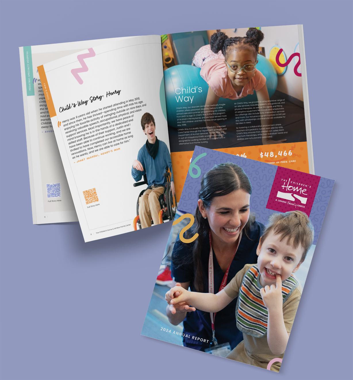
The Children’s Home of Pittsburgh Annual Report: Telling Stories of Care, Hope, and Growth Through Design
The Annual Report for The Children’s Home of Pittsburgh was designed to celebrate childhood, resilience, and hope while clearly communicating the organization’s impact. The visual language balances professionalism with warmth, using fun, vibrant colors and playful imagery of children to reflect the joy and optimism at the heart of the organization’s mission.
Bright, cheerful color palettes were paired with approachable typography to create an inviting experience for readers. Photography of children and families was thoughtfully integrated throughout the report, reinforcing authenticity and emotional connection while ensuring the content remained respectful and mission-focused. Clean layouts and generous white space helped maintain clarity and readability, allowing key stories, statistics, and outcomes to stand out.
Open for a Description of the Annual Report
Design Process
The design process began with an in-depth understanding of The Children’s Home of Pittsburgh’s mission, audience, and goals for the annual report. We focused on creating a piece that would resonate with donors, families, and community partners while reflecting the organization’s commitment to care, growth, and compassion.
Concept Development
We developed a visual concept centered on childhood joy and progress, using color and imagery to convey positivity and forward momentum. Mood boards and color explorations helped establish a playful yet polished aesthetic.
Visual Storytelling
Photography and illustrations were selected and arranged to tell meaningful stories of the children and families served. Images were treated with care to feel natural, joyful, and engaging, enhancing the narrative rather than overpowering it.
Layout & Typography
A flexible grid system allowed for dynamic page layouts while maintaining consistency throughout the report. Friendly, modern typography supported readability and complemented the playful tone of the design.
Refinement & Collaboration
The design evolved through close collaboration with stakeholders, incorporating feedback to ensure the final report accurately reflected both the organization’s impact and its values.
Final Result
The final annual report is a bright, engaging, and heartfelt publication that communicates impact through thoughtful design. By combining fun colors, playful imagery, and clear information hierarchy, the report successfully captures the spirit of The Children’s Home of Pittsburgh while reinforcing trust, transparency, and community connection.
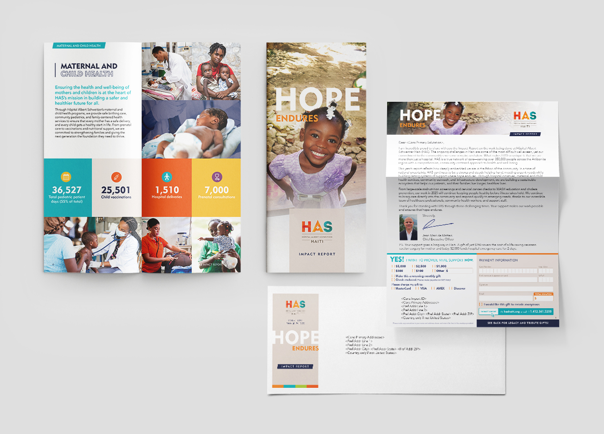
From Story to Support: A Hospital Impact Report & Appeal Letter
Hôpital Albert Schweitzer HAITI, Impact Report and Donor Solicitation Letter were designed as a cohesive, donor-focused communication that clearly connects mission, outcomes, and the call to give. The 12-page mailed report presents the hospital’s impact in a clear, compelling format, while the accompanying appeal letter reinforces urgency and personal connection, encouraging readers to take action.
The visual design balances credibility and compassion, using clean layouts, thoughtful typography, and purposeful imagery to reflect the hospital’s professionalism while highlighting the human stories behind the data. Consistent branding across both pieces ensures they feel unified, intentional, and easy to navigate for recipients.
Award of Merit Design Winner: PA School Public Relations Association
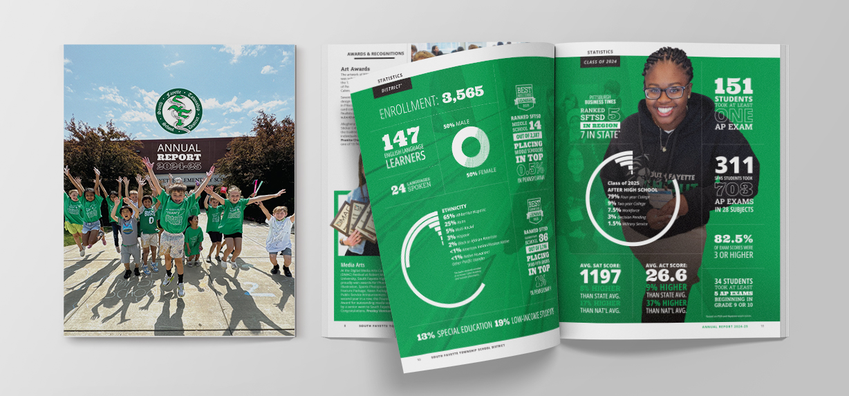
South Fayette Township School District Annual Report: Inspiring Stories, Beautifully Told
Discover the South Fayette Township School District Annual Report Through a Captivating Visual Narrative
Our Annual Report design for a School District is more than just a presentation of financials; it’s a beautifully designed publication that showcases the district’s commitment to excellence and celebrates the inspiring achievements of students and staff.
Open for a Description of the Annual Report Development Process
Key Features:
Designed for Impact:
A visually stunning presentation that tells the South Fayette story through impactful imagery, compelling infographics, and a user-friendly layout.
Data-Driven Design:
Complex financial and academic data is transformed into engaging visuals, making it accessible and easy to understand for all audiences.Designing a School District’s Annual Report involves a thoughtful blend of creativity and clarity. Here’s a breakdown of the process:
Discovery and Planning
Initial Meetings:
Collaborate with the district’s leadership to understand key themes—student achievements, academic progress, financial transparency, and future goals.
Content Gathering:
Collect raw data, including financial reports, test scores, success stories, and staff highlights.
Audience Consideration:
Ensure the report speaks to a wide audience—parents, staff, community members, and stakeholders—keeping accessibility in mind.
Concept Development
Visual Theme:
Establish a design direction that reflects the district’s brand—colors, fonts, and imagery—while ensuring a modern, clean look.
Key Messaging:
Identify headline messages that celebrate accomplishments and reinforce the district’s mission.
Design and Layout
Data Visualization:
Create charts, graphs, and infographics that simplify complex data, making it engaging and easy to understand.
Photography:
Incorporate high-quality images of students, staff, and events to humanize the content.
Typography and Whitespace:
Use clear fonts and balanced spacing to maintain readability and visual appeal.
Drafts and Revisions
Initial Design Draft:
Present a first draft with sample layouts for financials, success stories, and key stats.
Feedback Rounds:
Refine based on district feedback, ensuring accuracy in data and alignment with their goals.
Finalization
Proofreading:
Double-check all content for accuracy—especially numbers and names.
Accessibility Checks:
Ensure digital versions are ADA-compliant and print versions are easy to read.
Production and Distribution
Print-Ready Files:
- Prepare high-resolution files for printing.
- Coordiante the printing.
Digital Version:
Create an interactive PDF / webpage version for online access.
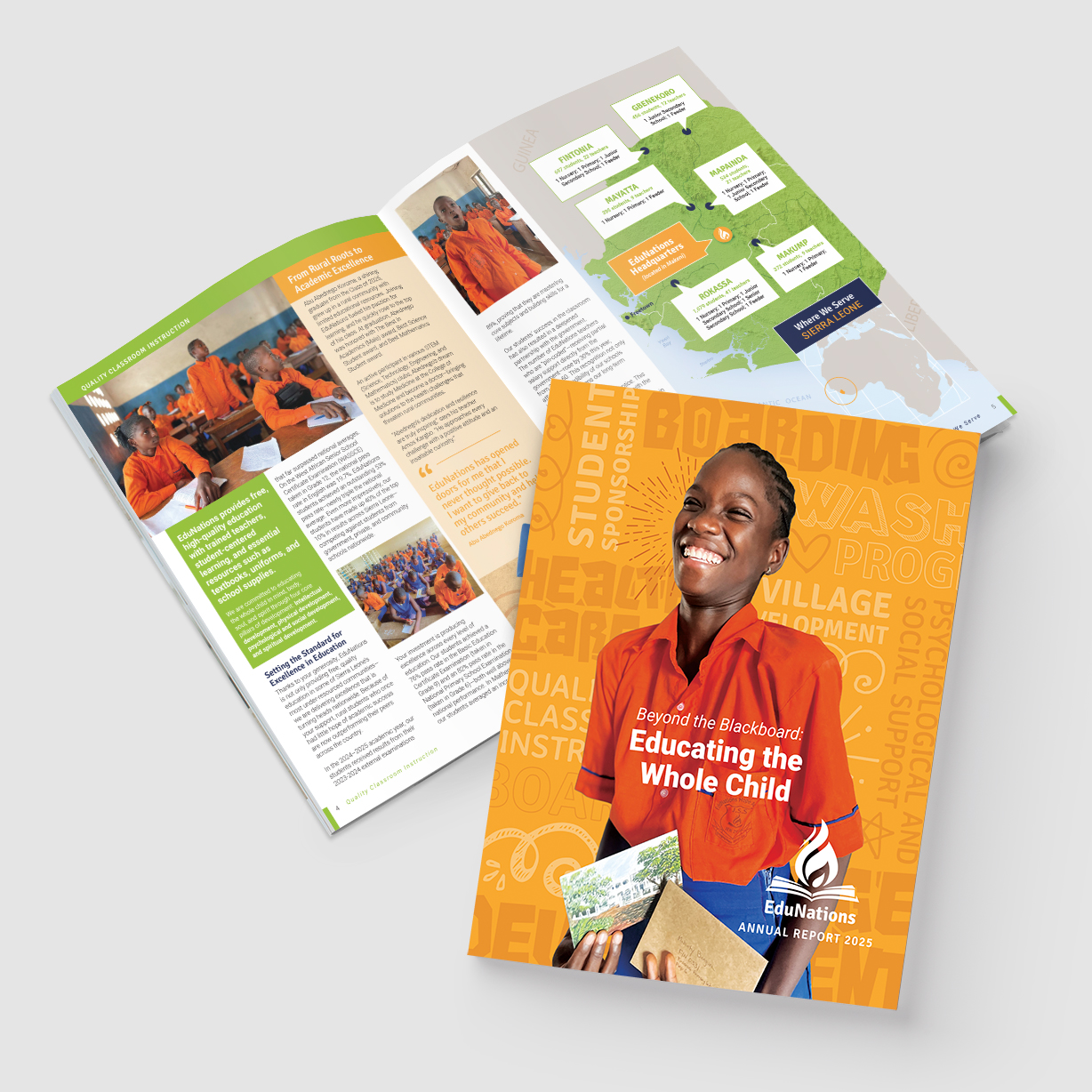
A Vibrant Annual Report Celebrating Global Education Impact
Open for a Description of the Annual Report Design
Dynamic Page Layouts:
A flexible grid system allowed for varied compositions across spreads, keeping the long-form document visually fresh while maintaining consistency and clarity.
Human-Centered Imagery:
Photography highlighting students, educators, and communities were integrated to bring EduNations’ mission to life and reinforce the real-world impact of its work.
Clear Information Hierarchy:
Data, stories, and outcomes were organized with strong typographic contrast, callouts, and infographics to make complex information easy to scan and understand.
Modern, Friendly Typography:
Clean, contemporary typefaces were selected to support readability while complementing the report’s lively, uplifting aesthetic.
Cohesive Visual Storytelling:
Color, imagery, and graphic elements work together across all 24 pages to create a unified narrative that communicates progress, impact, and hope through design.
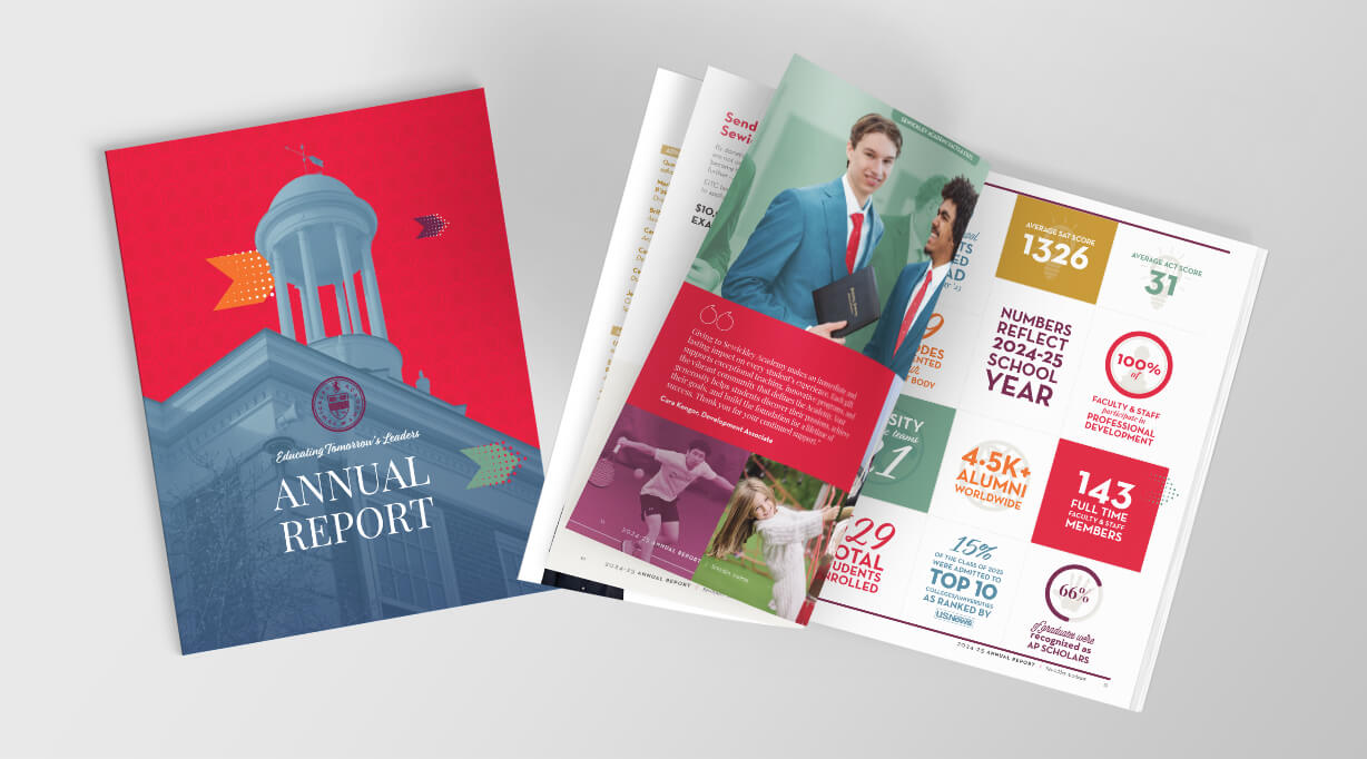
Good Design Turns an Annual Report Into a Relationship Builder for a Private School
Open for a Description of Sewickley Academy's Annual Report
Discovery & Alignment
We began by immersing ourselves in Sewickley Academy’s mission, audience, and institutional voice—ensuring the report reflected both academic excellence and community values.
Story-first Structure
We translated a year of achievements, milestones, and data into a clear narrative arc, guiding readers through the school’s impact rather than overwhelming them with information.
Visual Hierarchy & Clarity
Thoughtful typography, pacing, and layout were used to make complex content approachable, scannable, and engaging for a wide range of readers.
Purposeful Imagery
Photography and graphic elements were curated to highlight authentic moments, reinforcing the school’s culture and bringing stories to life.
Brand Stewardship
The design respected and elevated Sewickley Academy’s visual identity, creating consistency with existing materials while giving the report a refined, contemporary presence.
Print & Digital Optimization
Final layouts were crafted to perform beautifully in both print and digital formats, extending the report’s reach and usability.
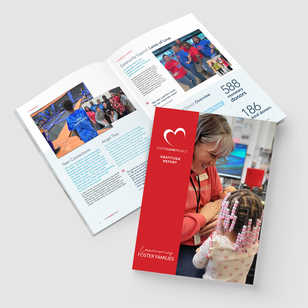
Foster Love Project Gratitude Report Design
A 12-Page Report on the Progress Made to Help Foster Children
Foster Love Project engaged our design and print services to let their donors know everything about that’s been accomplished in the last year with their donations.
Get in Touch with Us
We’re here to help you bring your vision to life. Reach out today to discuss your project.
Common Questions
Explore common inquiries about nonprofit annual report design.
Have more questions?
Our goal is to help clarify any uncertainties. This section highlights some common questions and answers to aid your decision-making process.
The design process typically varies based on the complexity of the report. On average, it takes about 4 to 6 weeks from initial consultation to final delivery. We prioritize collaboration and feedback for the best results.
To get started, we have a brainstorming session to review and undersatnd your goals. We discuss your key highlights, branding materials, and any specific design preferences. The more detailed the information, the better we can tailor your report.
We provide a quote and timeline for teh project.
Absolutely! We can always make updates and revisions. Keeping your annual report current is essential, and we will be here to assist with any changes you need down the line.
Of course! We have a range of design styles, from clean and modern to more traditional layouts. During the consultation, we’ll discuss your vision to ensure the final product reflects your choices and your organization’s identity.
If you have branding standards, we’ll follow them accurately.
Our pricing is transparent and varies based on the project scope. After our initial meeting, we will provide a detailed quote that considers your needs and budget.