
Nonprofit Brochures, Newsletters, Catalogs & Magazine Design Samples
If you’re seeking greater readership of your publications, choose us to craft a design format that compels readers to dig into your publication. We create newsletters and brochures that visually move readers to your most important messages.
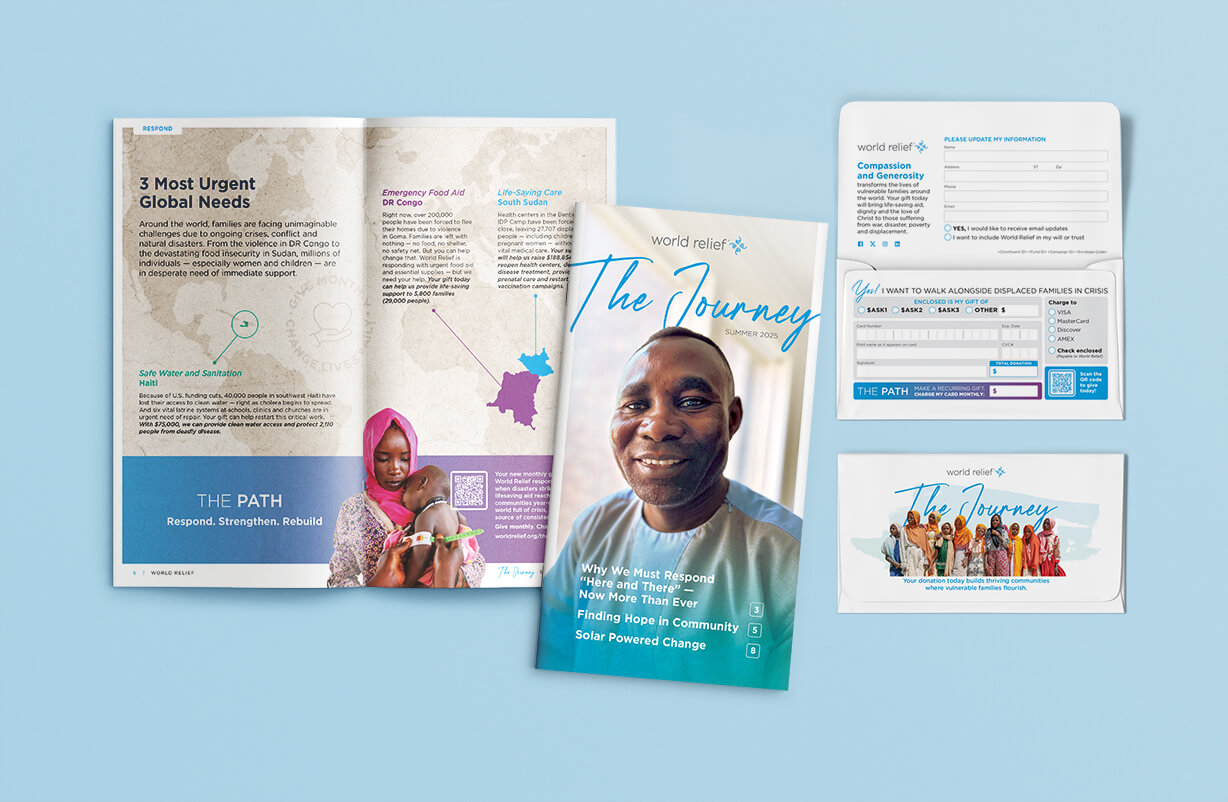
Stories of Compassion in Action—a Newsletter Designed to Bring Hope
This beautifully designed newsletter brings to life World Relief’s mission to equip and mobilize the global church in response to the world’s most urgent humanitarian crises. Through thoughtful layout and warm, inviting visuals, the piece reflects the heart of an organization rooted in faith, service, and partnership.
Each section is carefully structured to guide readers through stories of impact—from communities rebuilding after disaster to families finding safety, dignity, and opportunity. Clear typography, intentional pacing, and compelling photography work together to make complex global challenges feel personal, accessible, and hopeful.
The newsletter emphasizes connection: between churches and communities, donors and field partners, compassion and action. By highlighting real stories and measurable outcomes, it reinforces how collective faith and generosity can create lasting change in places facing conflict, displacement, and poverty.
The result is a communication piece that informs, inspires, and invites engagement. More than an update, the newsletter serves as a call to continued partnership—encouraging readers to see themselves as part of a global movement bringing hope, restoration, and Christ-centered care to those who need it most.
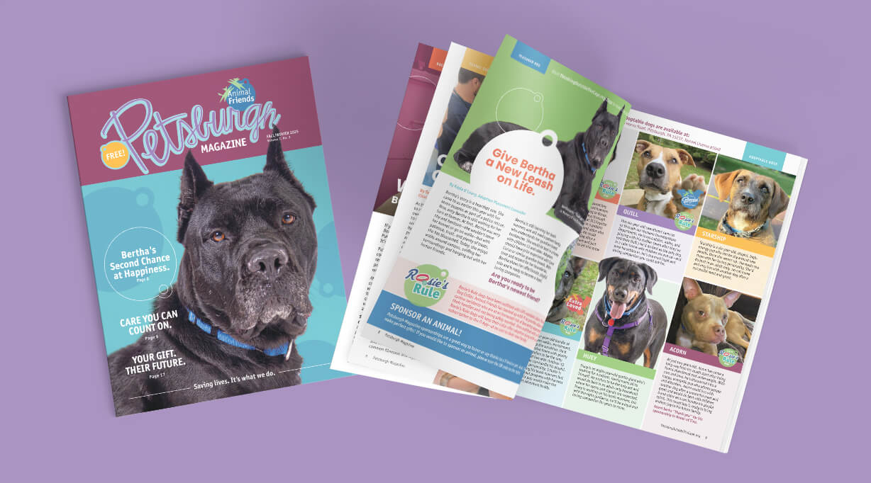
A Visual Tribute to Hope: A Beautifully Designed, Nonprofit Animal Rescue Magazine
The News Magazine of Animal Friends, Pittsburgh’s Premier Animal Shelter.
Experience the power of visual storytelling in our meticulously crafted, 32-page magazine. Petsburgh Press is a testament to the art of compassionate design. Vibrant colors and crisp images are used in a thoughtful layout. Immerse yourself in a visually engaging presentation that seamlessly blends captivating narratives with clean graphics.
Our talented team of designers has created a magazine layout that is both visually stunning and easy to navigate. It’s a celebration of life: Every page reflects the unique beauty and spirit of the animals we rescue.
The Pittsburgh Press magazine design process began years ago when we first started creating the publication artwork. We began with a deep dive into Animal Friends’ mission and target audience. We aimed to create a publication that would not only showcase adoptable animals but also inspire community engagement.
Next, we conducted thorough research on similar publications, analyzing their strengths and weaknesses. This helped us identify unique design elements that would make Pittsburgh Press stand out. We focused on a clean and modern aesthetic, emphasizing white space and a strong grid system for optimal readability.
A crucial step was developing a captivating visual style. We incorporated a vibrant color palette to reflect the joyful nature of pet adoption while maintaining a professional tone. High-quality retouching of the supplied photography was paramount, showcasing the animals in their best light. We also explored incorporating playful illustrations to enhance the magazine’s visual appeal.
Throughout the design process, we prioritized user experience. A clear and logical flow was essential, guiding readers seamlessly through the content. We ensured that key information, such as adoption contact details and volunteer opportunities, was easily accessible.
Finally, we collaborate closely with Animal Friends throughout the entire process, incorporating their feedback and ensuring the magazine accurately reflected their mission and values. The result is a visually engaging and informative magazine that effectively promotes animal adoption and strengthens the bond between the shelter and the community.
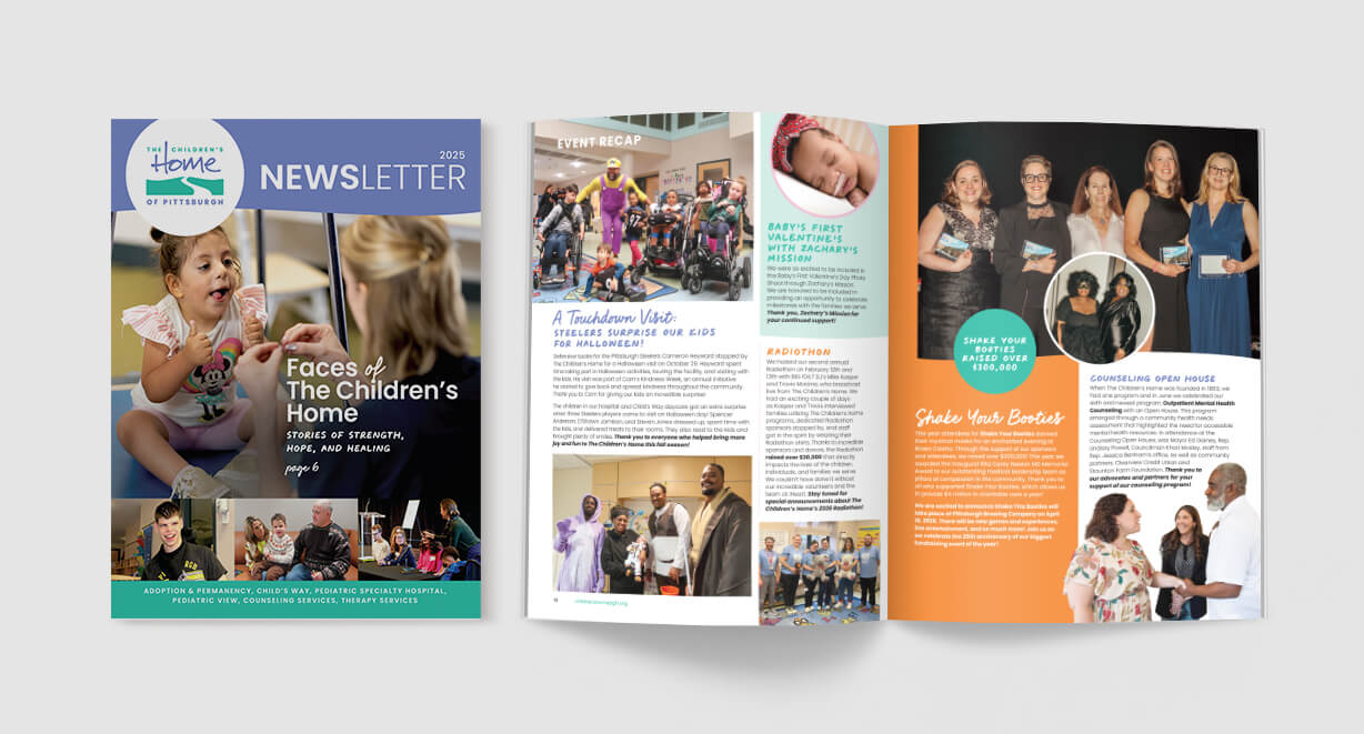

From Care to Community: Highlights from The Children’s Home Newsletter
We designed a mission-driven newsletter that informs, inspires, and strengthens community connection. The goal: turn meaningful content into a clear, engaging communication tool that drives awareness and action.
Our Approach
Strategy First
We aligned the newsletter structure with organizational goals—advocacy, visibility, and engagement—ensuring every section served a purpose.
Clear, Easy-to-Read Layouts
Content was organized for quick reading, with strong hierarchy and consistent sections that guide the reader from story to action.
Human-Centered Storytelling
Spotlights on board members and volunteers put faces to the mission, building trust and emotional connection.
Accessible, On-Brand Design
Clean typography, thoughtful color use, and flexible layouts ensure readability and brand consistency across every issue.
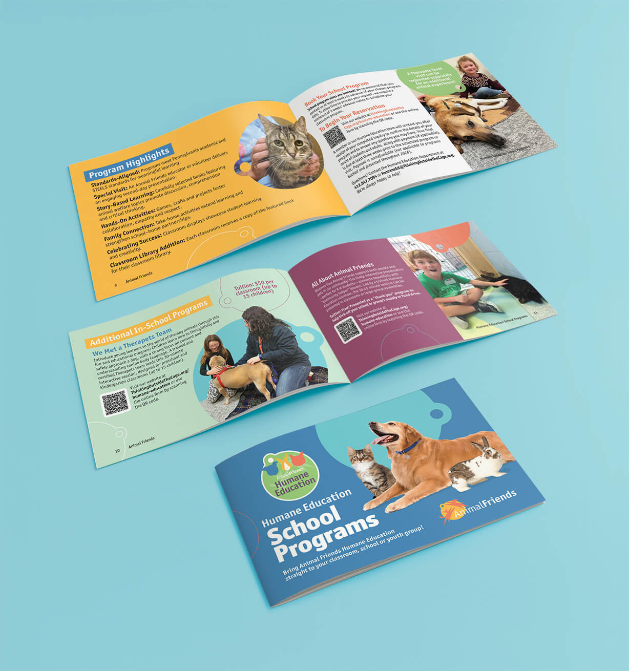
A Program Booklet Design That Educates and Engages
We designed a 12-page program booklet that transforms Animal Friends’ humane education offerings into a compelling, easy-to-use resource for educators. The booklet supports classroom learning, reinforces compassion, and drives program bookings—while staying true to a playful, child-focused theme.
Our Design Process
Strategic Content Mapping
We structured the booklet to mirror how teachers evaluate programs—by grade level, learning outcomes, and ease of booking. Content was intentionally sequenced to move readers from discovery to action.
Theme-Driven Visual Design
The design was inspired by “Tails & Whiskers: Reading and Caring Adventures,” using friendly illustrations, energetic color palettes, and storytelling elements that appeal to children while remaining credible for educators.
Grade-Level Differentiation
Distinct visual cues help educators quickly identify programs for:
- Kindergarten & 1st Grade
- 2nd & 3rd Grade
- 4th & 5th Grade
This clear segmentation improves usability and speeds decision-making.
Engaging Educational Layouts
Each program spread balances imagery, book highlights, and concise descriptions to keep information approachable and visually engaging—ideal for busy teachers.
Clear Calls to Action
Strong, well-placed calls to action encourage educators to book a school program and schedule a classroom visit with an Animal Friends representative and their pet.
Flexible, Future-Ready Design
The booklet was built with a modular layout system, making it easy to expand as new books or programs are added.
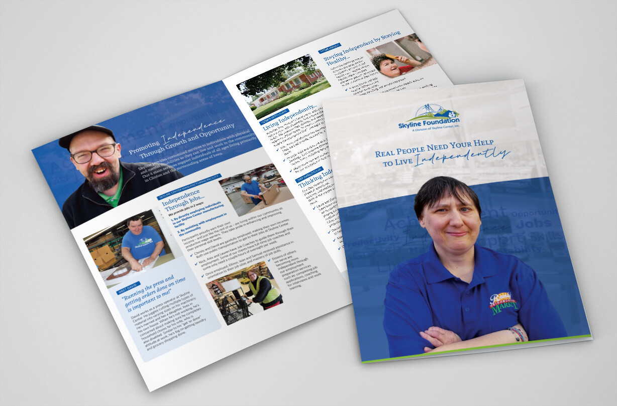
Brochure Design for a Foundation that Supports Individuals with Disabilities
Creating a 4-page brochure for Skyline Foundation, a nonprofit dedicated to empowering individuals with disabilities, required a collaborative and thoughtful process to ensure the final piece was both compelling and visually appealing. Our team approached the project with care, balancing storytelling with design to create a brochure that would resonate with potential donors while reflecting the values of the organization.
Research and Discovery
We began by immersing ourselves in Skyline Foundation’s mission and impact. To capture authentic and meaningful stories, we conducted interviews with staff members and individuals served by the organization. These conversations provided invaluable insights into the challenges faced by those with disabilities and the ways Skyline Foundation promotes independent living. Through this research, we identified recurring themes such as empowerment, community support, and personal transformation, which became the foundation of the brochure’s messaging.
Crafting the Copy
With a clear understanding of the audience and the organization’s goals, we developed a narrative that was both emotional and action-oriented. The copy highlighted:
- Stories of individuals who achieved greater independence through Skyline Foundation’s programs.
- Specific services and initiatives offered by the organization, showcasing their impact.
- A call to action for donations, emphasizing how contributions directly support individuals with disabilities.
We used a conversational tone to engage readers while maintaining professionalism. Each section was carefully structured to build a sense of connection and urgency, encouraging readers to take action.
Designing the Visuals
In parallel with the copywriting process, our design team worked on creating a layout that complemented the storytelling. The design featured:
- High-quality photos of individuals served by Skyline Foundation, ensuring the brochure felt personal and relatable.
- A clean, accessible layout with large fonts and ample white space, making it easy to read for all audiences.
- A color palette aligned with Skyline Foundation’s branding, evoking warmth and optimism.
Collaboration and Refinement
Throughout the process, we collaborated closely with Skyline Foundation to ensure the brochure aligned with their vision. Regular feedback sessions allowed us to refine the content and design, ensuring accuracy and resonance with their target audience.
Final Product
The resulting 4-page brochure is a powerful tool for Skyline Foundation’s fundraising efforts. It weaves together compelling stories, impactful visuals, and a strong call to action, inspiring donors to support the organization’s mission of promoting independent living. This project underscores the power of thoughtful storytelling and design in advancing the work of nonprofits.

See a short video of this brochure.

See a short video of this brochure.
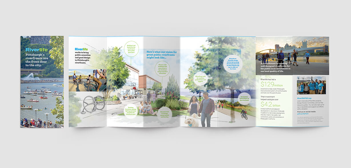
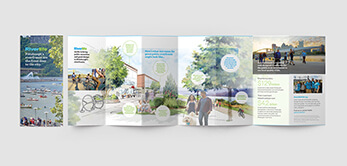
Nonprofit, Multi-panel Brochure
An Engaging Brochure for a Nonprofit Whose Business is Beautifying Riverfronts
This brochure was designed to show property owners how to transform their riverfront property into a destination. It also communicates information about the many succesful riverfront projects in Pittsburgh, PA. Illustrations were custom-created by Direct Axis.

Flyers for Nonprofit Community Services
Branded Service Hand-Outs
Pa Connecting Communities needed a uniform look for their service offereings. We created an attractive design and applied it to each of their services.
Branding print publications for nonprofits is a thoughtful process that ensures consistency, builds recognition, and strengthens your message. Here’s a breakdown of how it typically works:
Discovery & Research
We Understand Your Mission: Together, we dive into the nonprofit’s goals, values, and target audience.
Audit Existing Materials: Together, we review current brochures, flyers, and other print materials to identify what’s working and what’s not.
Gather Inspiration: Together, we look at peer organizations or impactful design trends that align with your identity.
Brand Development
Logo & Color Palette: We establish or refine your logo, choosing colors that reflect your personality—bold for advocacy, soft for support services, etc.
Typography: We select fonts that balance readability with character, ensuring accessibility.
Imagery Style: Together, we decide on photography, illustrations, or iconography that best tell their story—often human-centered for community services.
Design System Creation
Templates & Layouts: We’ll develop adaptable templates for your brochures and flyers, ensuring flexibility for various content but with a consistent structure.
Visual Hierarchy: Together, we’ll define how headlines, subheads, and body text are styled to guide readers seamlessly through the material.
Brand Voice: Craft a tone of voice—whether warm, professional, or urgent—to reflect your nonprofit’s approach to communication.
Application to Publications
Individual Service Flyers/Brochures: We’ll apply the branded design to each offering—like the ones shown above: Academic Support, Employment Services, Independent Living—using color coding, icons, or specific layouts to differentiate programs while keeping the overall look unified.
Imagery & Graphics: We incorporate meaningful photos or graphics, ensuring diversity and authenticity, especially for community-focused organizations.
Calls to Action: Emphasize clear CTAs, like “Get Involved,” “Donate Now,” or “Learn More,” using design to make them stand out.
Print-Ready Files: For your printed materials, we provide quotes based on various quantities.
Digital Versions: We prepare versions optimized for email, social media, or website downloads.
Brand Guidelines: Optionally, we can create a mini brand guide to help your nonprofit maintain consistency when producing future materials.